Milwaukee Bucks
The new Buck is only looking ahead, an imposing figure determined and focused on the path in front of him. An expanded rack (from 8 to 12 points) showing the maturation of the Buck, and underlining the point that he has become an even greater force. The basketball feature in the negative space between the antlers. The M Shape within the chest chevron as an homage to Milwaukee. With hard edges that appear almost cut from metal, and industrial but classic proprietary font juxtaposed against the curvature of the logo represents a symbolic union of urban and rural Wisconsin.
Bucks Alternate Logo
The Milwaukee Bucks have a long and storied history with their alternate logos, beginning in the 1970s when they first adopted the iconic “Buck” logo. This logo featured a buck leaping over an M-shaped silhouette of Wisconsin and was used as an alternative to their primary team mark until it was retired in 1993. Since then, the Bucks have gone through several iterations of alternative logos that help to further define their identity and brand recognition among fans worldwide.
In 1994, following the retirement of the Buck logo, they introduced two new designs: one featuring a stylized deer headset against a basketball hoop; another featuring three interlocking “M” letters representing Milwaukee (the city where they play). The latter design has become particularly popular amongst fans due to its simple yet effective branding strategy – by using just three letters for identification purposes it is easily recognizable even from afar or on small items such as hats or t-shirts.
More recently however (in 2012), after nearly 20 years without changing any of its alternative marks at all - The Bucks unveiled yet another new look: this time taking inspiration from traditional Native American imagery depicting Wisconsin's state animal – namely deer tracks forming an "M." This latest redesign has been met with much enthusiasm both locally within Milwaukee itself but also across other parts of America too - proving once again how important having distinctive visuals can be for sports teams seeking greater recognition beyond just local markets!
Milwaukee Bucks
2016 - Present
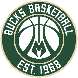
A basketball with antler-style shape in the seams, stylized letter "M" at the bottom, inside a green and cream roundel with a wordmark "BUCKS BASKETBALL" on top and establishment year "1968" on the bottom. The letter "M" represents the city of Milwaukee, Wisconsin.
Milwaukee Bucks
2016 - Present
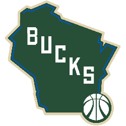
A map of the State of Wisconsin in green with cream trim, blue lines highlight the location of lakes and river borders. Wordmark "BUCKS" running diagonally down with a basketball placed on the City of Milwaukee.
Milwaukee Bucks
2016 - Present
Green and cream buck deer head with stylized letter "M" in the neck.

Milwaukee Bucks
2016 - Present
Green and cream basketball with deer antler design in the seams, the letter "M" in green at bottom. The letter "M" represents the city of Milwaukee, Wisconsin.

Milwaukee Bucks
2006 - 2015
Silver buck antlers with a green basketball on a red triangle with a sliver outline.

Milwaukee Bucks
2006 - 2015
A green and white buck head with 8-point antlers.

Milwaukee Bucks
2000 - 2006
A green and white buck head with 8-point antlers with purple eyes.

Milwaukee Bucks
2000 - 2005
Silver buck antlers and a green basketball on a purple triangle with silver and green outline.

Milwaukee Bucks
2000 - 2004
A green and white buck head with 8-point antlers with purple eyes. In front of a purple with silver trim triangle.

Milwaukee Bucks
1979 - 1993
A orange buck with a green sweater and the letter "B" on it spinning a orange and black basketball. The letter "B" stands for the team nickname Bucks.

Basketball Sports Fan Products