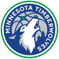
Minnesota Timberwolves
A wolf howling in blue, green, grey, and white in front of a basketball moon in silver, and again includes a green “North” star shape with an inverse tree forest. A wordmark encircles the wolf “MINNESOTA TIMBERWOLVES” in white within a blue roundel trimmed in white and green. Also, they altered their color scheme to align more closely with the Kelly green and blue they originally used from 1989 to 1996.


Minnesota Timberwolves
2009 - 2017
Single lined wordmark "WOLVES" in black with gray and blue outline.
Font: Walshes by Larabie Fonts
https://famfonts.com/minnesota-timberwolves/
Minnesota Timberwolves
1997 - 2008
Single lined wordmark "TIMBERWOLVES" in black with grey and black outline.
Font: Walshes by Larabie Fonts
https://famfonts.com/minnesota-timberwolves/
Minnesota Timberwolves
1997 - 2008
Double lined wordmark "MINNESOTA" on top in black and "TIMBERWOLVES" on the bottom in blue.
Font: Walshes by Larabie Fonts
https://famfonts.com/minnesota-timberwolves/
Unlocking Secrets: Minnesota Timberwolves Logo History Revealed!
Welcome to our channel, where we delve into the intriguing history of the Minnesota Timberwolves logo! In this video, we unravel the evolution of the Minnesota Timberwolves logo from its inception to the present day. Join us on a journey through time as we decode the symbolism and design choices behind each iteration. Explore the fascinating transformation of one of the NBA's iconic logos with us! Don't forget to like, share, and subscribe for more captivating content!
"Legends Live on the Court. Legacies are Worn Every Day"
From the hardwood of the 80s to the high-flying stars of 2026, the game is always with you. Whether you're repping a Hall of Fame icon or the league's newest MVP, find the official colors that define your game.
Shop the Official NBA Store