Memphis Grizzlies
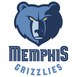
Slight adjustments made to previous Grizzlies’ primary logo, which include removal of lightest of their three blues at the snout, addition of grey outline, and new wordmark font “MEMPHIS” and “GRIZZLIES” in blue.

Memphis Grizzlies
2005 - 2018
The current logo was adopted in 2004 and featured a more benign-looking grizzly bear head accented in three different shades of blue and with yellow eyes. A wordmark “MEMPHIS” in a two-tone blue color and a wordmark “GRIZZLIES” in light blue on the bottom. Though not the snarling grizzly bear as on the original logo, the new bear logo still reflects a level of focus and intensity.

Memphis Grizzlies
2002 - 2005
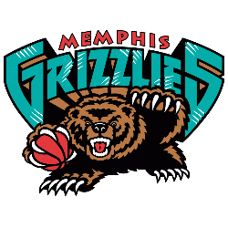
When the Grizzlies moved to Memphis, they used the same logo from Vancouver and replaced the city wordmark with "MEMPHIS" in red.

Vancouver Grizzlies
1996 - 2001
The original Grizzlies logo featured a grizzly bear holding basketball with teeth and claws out. A wordmark "VANCOUVER" in red above the wordmark "GRIZZLIES" in teal on top of the grizzly. The letters "G" and "S" are larger than the other letters in the wordmark "Grizzlies."
How the Memphis Grizzlies Logo Changed
The Memphis Grizzlies logo history kicked off in 1995 with a teal bear in Vancouver. First, the old Memphis Grizzlies logo had a cartoonish vibe. Then, it got tougher. Visit the NBA Grizzlies page for team info. Now, it’s a fierce symbol.
"Legends Live on the Court. Legacies are Worn Every Day"
From the hardwood of the 80s to the high-flying stars of 2026, the game is always with you. Whether you're repping a Hall of Fame icon or the league's newest MVP, find the official colors that define your game.
Shop the Official NBA Store

