Oklahoma City Thunder
The Oklahoma City Thunder unveiled their first logo on September 3, 2008. The logo is a large blue and yellow banner with the logo in the middle with the wordmark “OKC,” and splashes of yellow at the top and reddish-orange at the bottom. On top is the wordmark “THUNDER.”
Oklahoma City Thunder
2009 - Present
"OKC" in white on a blue, white and yellow shield with a orange basketball. The letters "OKC" stand for the city and the team nickname Oklahoma City Thunder.

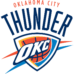
Oklahoma City Thunder
2009 - Present
"OKC" in white on a blue, white and yellow shield with a orange basketball with a wordmark "OKLAHOMA CITY" in orange and "THUNDER" arched above in blue.
The Identity of Oklahoma City Thunder Alternate Logos
The Oklahoma City Thunder logo history started in 2008 after relocating from Seattle. First, an alternate Oklahoma City Thunder logo featured a blue shield with “OKC” in white. Then, a 2017 tribal-inspired design emerged because fans valued its local roots. Now, these alternates are modern classics. Visit the NBA Thunder page for team details.
Our alternate Oklahoma City Thunder logo collection highlights the 2017 tribal-inspired design, a favorite for fans seeking Oklahoma City Thunder logo png files. Collectors value these alternate logos for gear inspired by Oklahoma City Thunder logo redesign concepts. For the primary design, visit our Oklahoma City Thunder primary logo. This alternate logo collection reflects the Thunder’s bold identity, tied to Oklahoma’s storm-driven spirit and 2025 NBA championship.
Basketball Sports Fan Products