Brooklyn Nets
A black letter “B” on a white basketball with black seams inside a black circle with the wordmark “BROOKLYN NETS” arched around in white.
Nets Primary Logo
The Brooklyn Nets is a professional basketball team based in the borough of Brooklyn, New York City. The team was founded as part of the American Basketball Association (ABA) in 1967 and joined the National Basketball Association (NBA) after its merger with ABA in 1976. Over its long history, the franchise has seen many changes to its logo—from colors to designs—as they have evolved.
Since joining NBA from ABA, the first logo for Brooklyn Nets featured an orange circle with ‘Nets’ written across it, along with blue and white stripes at the top and bottom, respectively. This design remained unchanged until 2012, when it underwent significant modifications. The new version had a black shield-like shape that included an italicized font spelling out 'BROOKLYN' above 'NETS' written below within two blue lines on each side representing East River bridges connecting Manhattan to Long Island, where Barclays Center is located. It also featured five stars around BROOKLYN, representing each of the five boroughs – Bronx, Queens, Staten Island, Manhattan & Brookly n - that makeup New York City.
In 2017, another redesign happened where they dropped a shield-like shape but retained colors used before while adding grey color to give it a more modern look & feel, resulting in the current primary Logo for Brooklyn Nets featuring blocky lettering style combined forming a wordmark ‘Brooklyn’ inside an oval containing wordmark ‘NETS’ underneath all this set against gradient background consisting shades ranging from black to grey creating unique visual identity instantly recognizable by fans worldwide making them proud supporters of their beloved basketball club!
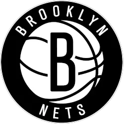
Brooklyn Nets
2013 - 2025
The Nets logo features a blacked out shield and the wordmark "NETS" accompanied by the letter "B" inside a basketball in a crest and "BROOKLYN" underneath.
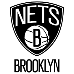
New Jersey Nets
1998 - 2012
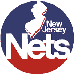
The Nets brought back the shield concept from their first logo while keeping the basketball that has been part of all but one. Most significantly, the team changed its color scheme for the first time: deepening the red, swapping royal blue for navy, and adding silver and dark grey.
New Jersey Nets
1991 - 1998
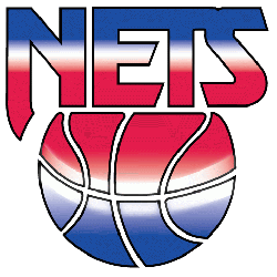
The red, white and blue gradient featured an all caps block "NETS" floating above a basketball that shared the same hues, hearkening back to the team's time in the ABA.
New Jersey Nets
1979 - 1991
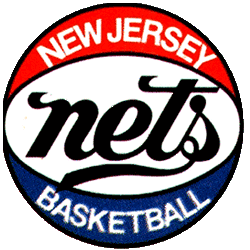
The Nets incorporated the state silhouette into a completely redesigned logo, doing away with the wordmark "nets" for a block lettered "Nets" in white, against a red and blue circle. In addition, a wordmark in the upper right corner "New Jersey" in white.
New Jersey Nets
1978 - 1979
For the team's first season in New Jersey, the team dropped the block "NY," keeping the familiar wordmark "nets" and the lettering is enlarged and darkened, now black rather than blue. A wordmark "NEW JERSEY" "BASKETBALL" in white above and below the scripted "nets."
New York Nets
1973 - 1977
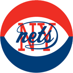
In 1972, the Nets opted to continue the previous logo with a red, white and blue basketball, much like the one the ABA used during games. They did retain the previous main logo, blue wordmark "nets" against a red block "NY."

New York Nets
1969 - 1973
After moving to Long Island, N.Y., the team first became known as the "New York Nets." Dropping the shield, but keeping the colors, the logo is known to feature a wordmark "nets" against a block-lettered red "NY" backdrop, and featuring a generic player alongside it in the color black.

New Jersey Americans
1967 - 1968
The original Americans logo is a red, white, and blue shield with ABA basketball in the center of the shield and a wordmark "N. J. AMERICAN" in white at the top.
Basketball Sports Fan Products


The NBA League Teams Logo Battle is an exciting event for Brooklyn Nets fans! As the teams compete to create the best logo, it's sure to be a thrilling competition. Fans can look forward to seeing their favorite team's design and cheering them on as they battle against other teams in this unique contest.
Hurry Nets Fans it is Time to Vote
Click to go to NBA Logo Battle and vote