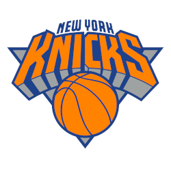
New York Knicks
A wordmark “KNICKS” in orange arched over an orange with blue trim basketball placed on a silver with blue trim triangle and “NEW YORK” arched above in blue.
Slightly tweaked the color of the orange lighter.
Knicks Wordmark Logo
The New York Knicks have a long and storied history of having one of the most iconic logos in professional sports. The logo, which features a blue basketball with orange lettering that reads “New York”, has been used since the team's inception in 1946. Over the years, however, there have been several variations on this classic design.
One such variation is an alternate logo featuring two interlocking Ns for New York inside an orange circle with white stars around it and a blue background. This version was first introduced during the 1995-96 season as part of an overall rebranding effort by then-owner ITT Corporation to give their teams more modern identities across all sports leagues they owned franchises in at that time (including hockey). The new look was widely praised by fans and critics alike who saw it as fresh change from traditional designs while still maintaining its connection to past versions through subtle nods like keeping same font style used before.
Since then this alternate version has become popular among many diehard NYK supporters who proudly sport apparel featuring both old & new looks when cheering on their beloved team! It also serves reminder how important branding can be creating lasting impressions over decades — something any business should strive achieve no matter what industry they operate within!

New York Knicks
2013 - Present
Wordmark "New York" in orange with a blue trim in a slight arch pattern.
Font: LMUpepbander
https://www.fonts4free.net/nba-knicks-font.html
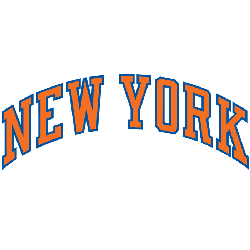
New York Knicks
1999 - Present
Wordmark "New York" in orange with a blue trim in a arched pattern.
Font: LMUpepbander
https://www.fonts4free.net/nba-knicks-font.html

