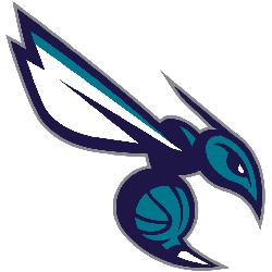
Charlotte Hornets
The new Hornets logo utilizes the purple and teal color palette and features an aggressive looking hornet that is ready to attack. Its piercing eyes, raised antennae, expanded wings and pointed stinger depict its relentless intensity. Incorporated within the logo is a basketball that doubles as the hornet’s body. The logo contains several odes to that of the original Hornets with its white wings, white accents within its eyes, a stinger and the inclusion of a basketball. A wordmark “CHARLOTTE HORNETS” in white.
Hornets Alternate Logo
The Charlotte Hornets' alternate logo history is an interesting and varied one. The team has gone through several iterations over the years, each with its own unique look. From their original teal-and-purple design to more modern takes on classic themes, the Hornets have consistently pushed boundaries in terms of branding and aesthetics.
In 1996, when the team was first established as an expansion franchise in North Carolina’s Queen City, they adopted a primary logo featuring a hornet wearing basketball shorts and sneakers inside of a roundel shape that resembled both an eye and basketball hoop netting. This iconic image became synonymous with Charlotte's NBA team for many years until it was replaced by another version in 2014 which featured two hornets facing off against each other above “Charlotte” written across them in bold lettering.
Since then there have been multiple additional alternate logos released including ones featuring only one hornet or two different colored stripes running down either side of it respectively; all while staying true to the color scheme originally used back when they were founded: teal & purple! With so many options available now fans can choose whichever style best suits their tastes or preferences without sacrificing any sense of loyalty towards their beloved hometown squad – The Charlotte Hornets!
Charlotte Hornets
2015 - Present
"BUZZ CITY" in white on hexagon background in dark purple with a teal and grey border.

Charlotte Hornets
2015 - Present
Front view of a hornet with white wings and stinger. A teal basketball as the hornet's abdomen and a white "H" for the neck.

Charlotte Hornets
2015 - Present
A teal "H" surrounded the letter "C" in dark purple and teal. A crown on top in dark purple with a teal ball on top. The letter "H" stands for the team nickname Hornets.

Charlotte Hornets
2015 - Present
Side view of a flying teal and white hornet with a white stinger pointed forward.
Charlotte Hornets
2015 - Present
Silhouette of a teal hornet.

Basketball Sports Fan Products