Rewind to the bold roots of the Tri City Blackhawks logo and its vibrant legacy. From its Midwest debut to iconic designs, we dive into the Blackhawks logo history, share Tri City logo images, and celebrate Tri City basketball, honoring the team’s spirit for every Blackhawks fan.
Tri-City Blackhawks
1946 - 1951
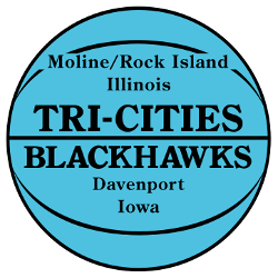
The Tri-City logo is a blue basketball with black outline and a wordmark of the "TRI-CITIES BLACKHAWKS." Also, on the basketball is a the tri-city names, "Moline/Rock Island" "Illinois" and "Davenport" "Iowa."

Tri-City Blackhawks
1946 - 1951
The Tri-City logo is a blue basketball with black outline and a wordmark of the "TRI-CITIES BLACKHAWKS." Also, on the basketball is a the tri-city names, "Moline/Rock Island" "Illinois" and "Davenport" "Iowa."
The Soar of the Tri City Blackhawks Logo
The Blackhawks logo history started in 1946 as the Buffalo Bisons before moving to Moline, Illinois. First, the Tri City Blackhawks logo featured a blue basketball with “TRI-CITIES BLACKHAWKS” text. Then, it honored Sauk Chief Black Hawk since fans loved heritage. Visit the NBA Hawks page for team details. It’s a timeless Tri City logo.
The 1946 Tri City Blackhawks logo showcased a black-outlined basketball, tying to Tri City basketball roots in Moline, Rock Island, and Davenport. Because it’s iconic, fans seek Tri City logo png files for nostalgic wallpapers. For unique designs, check our Atlanta Hawks Logo page. It captures the team’s pioneering spirit.

