Atlanta Hawks
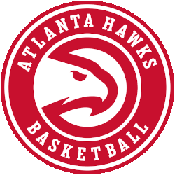
A minor update to the Atlanta Hawks primary logo for the 2020 – 2021 NBA season, the Hawks updated the font used in the wordmark in the roundel and also removed the word “CLUB” from the logo entirely. The team’s modernized “Pac-Man” logo remains, surrounded now with “ATLANTA HAWKS BASKETBALL” in white.
Hawks Primary Logo
The Atlanta Hawk's primary logo has a long and storied history. Since its inception in 1946, the team has gone through several iterations of its primary logo to reflect the changing times. The original design featured an abstract hawk head with wings outstretched against a blue background, symbolizing strength and power. This remained intact until 1971 when it was replaced by a more traditional-looking hawk illustration with red feathers, perched atop an orange basketball outlined in white. This version of the logo would remain unchanged for nearly two decades until 1992 when they introduced their most iconic look yet: “Pac-Man” Hawk Logo featuring an aggressive-looking bird sporting sunglasses and clutching a basketball under his wing while wearing sneakers on his feet!
This new look quickly became popular among fans who embraced its boldness and modern style as well as its connection to pop culture at that time period - Pacman being one of the most recognizable video games ever released! But after just four years on uniforms & merchandise, it was retired again due to copyright issues surrounding the use of copyrighted characters without permission from Namco (the company behind Pacman). In 1996 they unveiled another updated version which kept some elements from previous designs but added more detail like talons gripping onto either side of the ball or eye details that made him appear even sharper & fiercer than before!
In 2009 this fierce-looking hawk received yet another makeover resulting in what we know today – A sleekly designed silhouette with sharp features including piercing eyes focused forward towards victory; curved wings representing speed & agility; plus vibrant colors such as navy blue (symbolizing loyalty), red (representing passion) & yellow/orange accents throughout giving off energy vibes reminiscent Atlanta's famous neon lights skyline at nightfall. It is clear why this particular design continues to be used by both players& fans alike – not only does it represent all things great about ATL sports teams but also serves to remind those who come up short will ultimately face wrathful bird staring back at them if try to challenge city’s dominance any major sports category once again soon enough!

Atlanta Hawks
2015 - 2021
The new primary logo is an enhanced return to the team’s “Pac-Man logo” that was used from 1972 – 1995 and that served as the team’s secondary logo this season. The enhanced logo adds the words “Atlanta Hawks Basketball Club” around the Pac-Man design. The modernized ‘Pac-Hawk’ logo inside a red roundel, with a wordmark “ATLANTA HAWKS BASKETBALL CLUB” arched around in white.
Atlanta Hawks
2008 - 2015
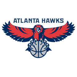
In 2007 the logo went through only minor changes. The logo removed yellow from the color scheme. The logo is exactly the same as the 1996 logo with the basketball changing to a gray color as well as all the other yellow on the hawk, which is again changed to gray. The wordmark is in the same location but now a different font "ATLANTA HAWKS" in navy blue.
Atlanta Hawks
1996 - 2008
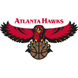
In 1996 a new redesign of the Hawk's logo with a front facing hawk with wings spread out in red and black with yellow claws and beak. The hawk is gripping a brown with black outline basketball. A wordmark "ATLANTA HAWKS" in a ancient looking font lettering in red.
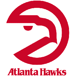
Atlanta Hawks
1973 - 1996
The 1972 version is the most memorable of the Hawks logos, because it looks like a "reverse Pacman." A wordmark "Atlanta Hawks" in red at the bottom. The logo is a thick red outline of a circle with a hawks face inside.
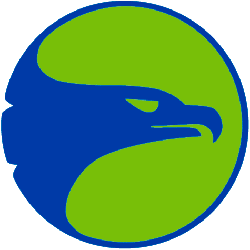
Atlanta Hawks
1971 - 1973
In 1971 the team changed colors and logo. The new logo features the face of a hawk facing to the right in blue. The logo is in a green background circle with a blue outline continuing from the hawk's image.

Atlanta Hawks
1970 - 1971
For one season in 1970 the logo changed to a newly designed hawk who is ball handling a basketball and attacking the basket. He was also drawn with 2 different colored lines of red and blue.
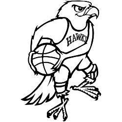
Atlanta Hawks
1969 - 1970
When moving to Atlanta, the logo continued for one year. The wordmark was removed and the color of the logo changed to black.
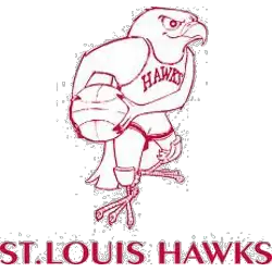
St. Louis Hawks
1958 - 1968
In 1957 the Hawks introduced this Disney-looking cartoon red hawk holding a basketball wearing a Hawks uniform and a wordmark "ST. LOUIS HAWKS" below the hawk. The hawk also has kneepads on each knee.
St. Louis Hawks
1956 - 1958
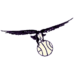
In 1955 the Hawks moved to St. Louis and introduced a similar black colored hawk soaring and holding basketball in it's claws without any wordmark.
Milwaukee Hawks
1954 - 1955
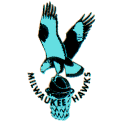
For what would ultimately prove to be their last season in Milwaukee, the Hawks updated their color scheme to blue. A change to their logo accompanied the shift with the hawk now in a light blue and black, still clutching a basketball over an unguarded hoop with the wordmark "MILWAUKEE HAWKS" arched upwards below.
Milwaukee Hawks
1952 - 1955
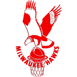
The Hawks adopted a red and white color scheme in the Cream City, a high-flying Hawk in red gripping a red basketball on top of a basketball hoop with the wordmark "MILWAUKEE HAWKS" in red in a U shape.
Tri-City Blackhawks
1946 - 1951
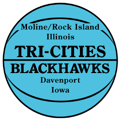
The Tri-City logo is a blue basketball with black outline and a wordmark of the "TRI-CITIES BLACKHAWKS." Also, on the basketball is a the tri-city names, "Moline/Rock Island" "Illinois" and "Davenport" "Iowa."
Basketball Sports Fan Products
The Atlanta Hawks have joined the NBA League Teams Logo Battle, a fun and exciting way to show fan support for their favorite teams! Fans can vote on their favorite logos from all 30 NBA teams to decide who has the best logo. Show your love for the Hawks by voting today and helping them win this battle of team pride!


