Seattle Sonics
2002 - 2008
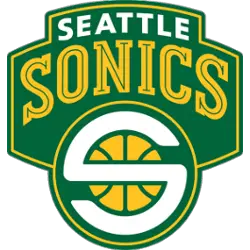
The final Sonics logo is a white colored "S" representing Seattle and Sonics written on a yellow basketball. The "S" is shaped to be circular so that it covers the ball. The logos is written on a green background which represents the team colors. On top is wordmark "SEATTLE" in white and "SONICS" in yellow with a green line throughout.
Sonics Alternate Logo
The Seattle SuperSonics have a long and storied history, with their alternate logos being no exception. The team has used several different designs over the years to represent the city of Seattle and its beloved basketball team. From classic cartoon-style renditions to modern takes on traditional symbols, these alternate logos capture the spirit of what it means to be a Sonic fan.
One of the most iconic designs is that of an anthropomorphic bulldog wearing sunglasses and carrying a basketball in its mouth – this logo was used from 1995 through 2001 before being replaced by another famous design featuring two “S”s intertwined in green and yellow colors (the same colors as those featured on their current primary logo). This version lasted until 2008 when they switched back to their original cartoonized mascot for one season before introducing yet another new look: A stylized “S” with sharp edges representing both speeds (hence why it was called "Speed S")and strength–this design remains today as part of their official branding identity.
Finally, there are also some special edition versions released every now and then such as during holidays or other events like All-Star Game appearances; These feature unique artwork or color schemes but still maintain elements from previous looks so fans can instantly recognize them without confusion! Ultimately all these various iterations demonstrate just how much passion goes into creating something truly unique for each individual franchise—the Seattle SuperSonics' alternate logos certainly do not disappoint!
Seattle Sonics
2002 - 2008
A white letter "S" on yellow basketball in a green circle with yellow trim. The letter "S" stands for the team nickname Supersonics.
A part of the primary logo without the wordmark.

Seattle Sonics
2002 - 2008
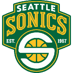
A white colored "S" representing Seattle and Sonics written on a yellow basketball. The "S" is shaped to be circular so that it covers the ball. The logos is written on a green background which represents the team colors. On top is wordmark "SEATTLE" in white and "SONICS" in yellow with a green line throughout. This alternative logo has "EST." and "1967" in white at the bottom.
Seattle Sonics
2002 - 2008
A white colored "S" representing Seattle and Sonics written on a yellow basketball. The "S" is shaped to be circular so that it covers the ball. The logos is written on a green background which represents the team colors. On top is wordmark "SONICS" in green with yellow trim.

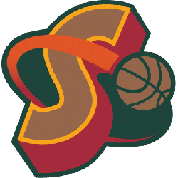
Seattle Sonics
1995 - 2001
A brown basketball orbiting a red letter "S." The letter "S" stands for the team nickname Supersonics.
