Philadelphia 76ers
The team’s new primary logo is a modern interpretation of the classic Sixers insignia, stylistically redeveloped to include a patriotic blue border with six white stars and “PHILADELPHIA” adorned across the heading. The familiar white basketball has been visually updated with a positional rotation of the seams. The emblematic ring of 13 stars present in the primary, partial and secondary logos continues to represent the original American Colonies.
Philadelphia 76ers
2010 - 2015
The Philadelphia 76ers have officially changed their primary logo and color scheme, returning to the traditional “76ers basketball” logo and the red, white, and blue color scheme. The logo features the 1978 logo smaller set on a red background with a silver border and a wordmark "PHILADELPHIA" in white on a blue background with a silver border.
Philadelphia 76ers
1998 - 2010
A wordmark "76ERS" in gold with a white trim on a black background and a red and silver star to the left. A gold basketball with blue flowing stripes are below.
Philadelphia 76ers
1978 - 1998
In 1978, the changed logo for the Sixers featured a smaller version of the last logo "7" in red "6ers" in blue with "13" revolutionary blue stars above "7" on white with blue trim basketball.
Philadelphia 76ers
1964 - 1978
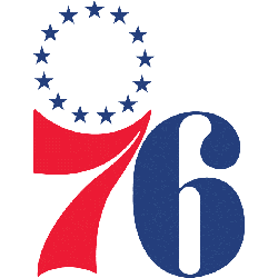
The first 76ers logo featured a large "7" in red and a large "6" in blue with "13" revolutionary blue stars above "7."
Syracuse Nationals
1950 - 1963
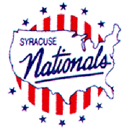
The Nationals final logo is a map of the US in white with blue wordmark "SYRACUSE Nationals" in blue on red and white stripes. Surrounded by several blue stars.
Syracuse Nationals
1947 - 1950
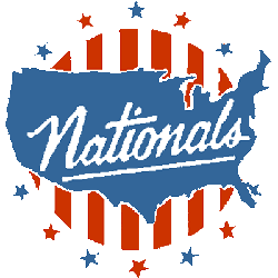
The original logo is a map of the US in light blue with white wordmark "Nationals" in white on red and white stripes. Surrounded by several blue and red stars.
The Path of the Philadelphia 76ers Logo
The Philadelphia 76ers logo history began in 1946 with a simple basketball. First, red, white, and blue honored Philly’s roots. Then, the design got sharper since fans wanted flair. Now, the Philadelphia 76ers logo shines. Visit the NBA 76ers page for team details. It reflects team pride.
"Legends Live on the Court. Legacies are Worn Every Day"
From the hardwood of the 80s to the high-flying stars of 2026, the game is always with you. Whether you're repping a Hall of Fame icon or the league's newest MVP, find the official colors that define your game.
Shop the Official NBA Store
