Our San Antonio Spurs logo collection showcases alternate logos from the team’s storied Texas legacy. From bold emblems to modern designs, learn about San Antonio Spurs logo history, find San Antonio Spurs logo png files, and explore new San Antonio Spurs logo styles for every Spurs fan.
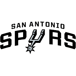
San Antonio Spurs
2017 - Present
Double arched wordmark “SAN ANTONIO” on top and “SPURS” on the bottom in black. The letter “U” is the alternate logo of a spur.
San Antonio Spurs
2017 - Present
A black with sliver outlines of a basketball with the letters "SA" centered and vertical. The letters "SA" represent the city of San Antonio.

San Antonio Spurs
2003 - Present
A silver spur used in the primary logo as the letter "U." No wordmark.

San Antonio Spurs
1990 - 2002
A black and sliver spur on a teal odd shaped background.

San Antonio Spurs Alternate Logo
The San Antonio Spurs logo history began in 1967 as the Dallas Chaparrals, moving to San Antonio in 1973. First, an alternate San Antonio Spurs logo featured a black spur with a silver star. Then, a 2017 fiesta-colored design emerged because fans loved its vibrant local flair. Now, these alternate logos are timeless classics. For team details, visit the NBA Spurs page.
Our alternate San Antonio Spurs logo collection highlights the 2017 fiesta design, a favorite for fans seeking San Antonio Spurs logo png files. Because they’re iconic, collectors prize these alternate logos for gear inspired by new San Antonio Spurs logo concepts. For the primary design, check our San Antonio Spurs primary logo. Thus, this alternate logo collection captures the Spurs’ rich history, from their ABA roots to five NBA championships.


