The Memphis Grizzlies logo has gone through a creative journey, especially in its alternate forms. This page showcases every secondary design used over the years. From aggressive bear imagery to bold typography, the alternate logos offer a deeper look at the team's evolving visual identity and branding direction.

Memphis Grizzlies
Slight adjustments made to previous Grizzlies’ primary logo, which include removal of lightest of their three blues at the snout, addition of grey outline, and new wordmark font “MEMPHIS” and “GRIZZLIES” in blue.
Memphis Grizzlies
2018 - Present
A grizzly bear claw gripping a basketball, rotated slightly from previous logo to allow claws to form a letter "M," colors also adjusted to new colors.

Memphis Grizzlies
2018 - Present
Some adjustments made to previous Grizzlies logo include removal of lightest of their three blues at the snout and addition of grey outline.
Memphis Grizzlies
2005 - 2018
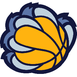
A blue bear claw holding a yellow and blue basketball.
Memphis Grizzlies
2005 - 2018
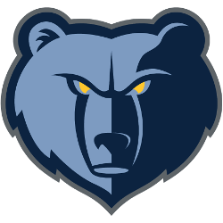
A blue bear head with yellow eyes.
This is part of the primary logo without the wordmark.

Memphis Grizzlies
2002 - 2004
A black silhouette of a grizzly bear's paw.
Memphis Grizzlies
2002 - 2004
A brown and black bear's claw holding a orange and black basketball.
Memphis Grizzlies
2002 - 2004
A brown and black grizzly bear holding a orange with black seems basketball.

Memphis Grizzlies
2002 - 2003
A brown and black grizzly bear with claws holding a green letter "G" with red flares striking the letter. The letter "G" stands for the team nickname Grizzlies.
Grizzlies Alternate Logo Designs Over Time
The Memphis Grizzlies have unveiled a variety of alternate logos since their move from Vancouver. Many feature stylized bear heads, aggressive accents, or unique fonts. These designs differ significantly from the core Memphis Grizzlies logo, often pushing creative boundaries. You can see the full Memphis Grizzlies logo history with primary visuals.
Over the years, these alternate designs appeared on jerseys, warm-ups, and merchandise. Some showcased retro elements, while others leaned into modern, minimal styles. Together, they show how the team’s branding evolved. To explore official branding, visit the NBA Memphis Grizzlies page.

