Atlanta Hawks
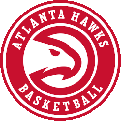
A minor update to the Atlanta Hawks primary logo for the 2020 – 2021 NBA season, the Hawks updated the font used in the wordmark in the roundel and also removed the word “CLUB” from the logo entirely. The team’s modernized “Pac-Man” logo remains, surrounded now with “ATLANTA HAWKS BASKETBALL” in white.
Atlanta Hawks
2021 - Present
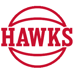
Wordmark "HAWKS" sandwiched between two halves of a basketball in red.
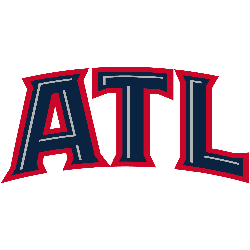
Atlanta Hawks
2021 - Present
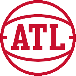
Initials "ATL" sandwiched between two halves of a basketball in red on a white background.
Atlanta Hawks
2015 - Present
Red and white hawk head inside of a red circle, modernized version of old team primary logo from the 70's. Commonly, but not officially, known as the Pac-man logo.

Atlanta Hawks
2015 - 2020
"ATL" arched in red and white. New font from the previous "ATL" wordmark. The initials "ATL" stand for the city of Atlanta.

Atlanta Hawks
2015 - 2020
Black and yellow hawk head inside of a black circle of the labeled "Pac Man Logo."

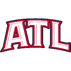
Atlanta Hawks
2015 - 2020
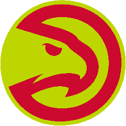
Red and yellow hawk head inside of a red circle of the labeled "Pac Man Logo."
Atlanta Hawks
2015 - 2020
Red basketball with a flame shooting up from it, two hawk wings on either side of the basketball.

Atlanta Hawks
2015 - 2020
Black basketball with a yellow flame shooting up from it, two hawk wings on either side of the basketball.

Atlanta Hawks
2015 - 2020
Red basketball with a yellow flame shooting up from it, two hawk wings on either side of the basketball.

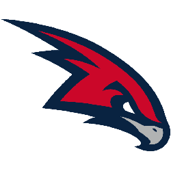
Atlanta Hawks
2014
Modernized Pac-Hawk logo from primary without the circle, known officially as a Partial logo. Shape of the hawk head adjusted very slightly from the version used in 2014.

Atlanta Hawks
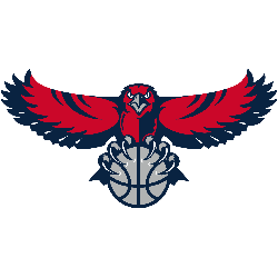
2008 - 2015
Red and dark blue flying hawk carrying a silver basketball.
The wordmark "Atlanta Hawks" is removed from the primary logo.
Atlanta Hawks
2007 - 2014
"ATL" in white outlined in red and blue. The initials "ATL" stand for the city of Atlanta.
Atlanta Hawks
2007 - 2014
"ATL" in blue outlined in red. The initials "ATL" stand for the city of Atlanta.
Atlanta Hawks
2007 - 2013
Red and blue hawk profile angling down with a silver beak.
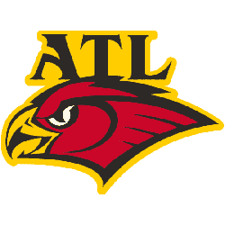
Atlanta Hawks
1998 - 2006
A Hawk profile in red with a yellow beak outlined in black with "ATL" in black with a yellow background. The initials "ATL" stand for the city of Atlanta.
Atlanta Hawks
1998 - 2006
Hawk profile in red with a yellow beak outlined in black.

Atlanta Hawks
1972 - 1994
A red circle with a hawks head.
The wordmark "Atlanta Hawks" is removed from the primary logo.