New York Knicks
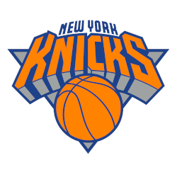
A wordmark “KNICKS” in orange arched over an orange with blue trim basketball placed on a silver with blue trim triangle and “NEW YORK” arched above in blue.
Slightly tweaked the color of the orange lighter.
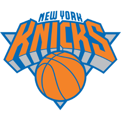
New York Knicks
2012 - 2024
The black was eliminated from the color scheme, and the words “New York” were continued. We really wanted to capture some of the feeling in New York, so we made the 'Knicks' font look up. It's as if you're right by the garden, looking up at the sky, and seeing tall shapes. That was the inspiration, and we added black below the lettering. Now it’s silver. We also improved the basketball to make it more authentic to the actual ball.
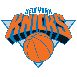
New York Knicks
1996 - 2012
The 1996 version of the "Classic Roundball Logo" has very slight changes to the colors. In addition, they added the wordmark "NEW YORK" in blue above the other wordmark.
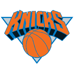
New York Knicks
1993 - 1996
Before the 1992 - 1993 season the Knicks updated their "Classic Roundball Logo" to its present form, with the wordmark "KNICKS" in a futuristic font, again superimposed over a orange basketball, with a silver triangle and a blue border accentuating the look. The "New Look" logo was designed by Tom O'Grady.

New York Knicks
1990 - 1993
The "Classic Roundball Logo" has been modified with an orange basketball with blue outline. The superimposed wordmark "KNICKS" is in orange with blue border.
New York Knicks
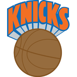
1984 - 1990
The Knicks made slight changes to the "Classic Roundball Logo" by again changing the basketball to brown with darker brown seams. The wordmark "KNICKS" changed back to orange with blue trim.
New York Knicks
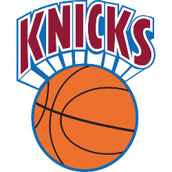
1980 - 1984
The "Classic Roundball Logo" changed in 1980 to a orange basketball with black seam and a blue outline. The wordmark "KNICKS" is now red on a white background with a blue trim.
New York Knicks
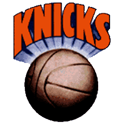
1965 - 1980
The Knickerbockers would introduce an iconic logo that would endure for the next three decades. Designed by Bud Freeman, the wordmark "KNICKS" superimposed over a brown basketball is known as the "Classic Roundball Logo."
New York Knickerbockers
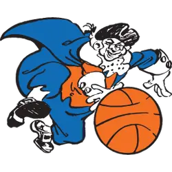
1947 - 1965
The first logo of the New York Knickerbockers is of a character named "Father Knickerbocker" dribbling a orange basketball with black outline, in the iconic blue and orange colors. It was designed by New York World-Telegram cartoonist Willard Mullin.
The Story of the New York Knicks Logo
The New York Knicks logo history started in 1946 with a basketball and “Knickerbocker” text. First, blue and orange defined the team’s vibe. Then, the design got cleaner because fans loved simplicity. Now, it’s a timeless symbol. Visit the NBA Knicks page for team details. The New York Knicks logo reflects city pride.
Basketball Sports Fan Products
