Seattle Seahawks
The new logo replaces the Seahawk blue with wolf grey. The Seattle Seahawks logo is comprised of the face of a sea hawk with the eyes, beak and the neck artistically illustrating the team’s quest for glory, pride and success. The fierce glare in the eyes of the Seattle Seahawks logo is basically derived from the Egyptian mythology where a falcon enjoyed a superior place in the hieroglyphs.
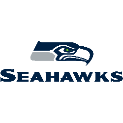
Seattle Seahawks
2012 - Present
Wordmark "SEAHAWKS" in blue below team's primary logo.
Font: Varation of LatinWidD
https://www.wfonts.com/font/latinwidd
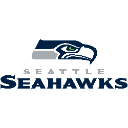
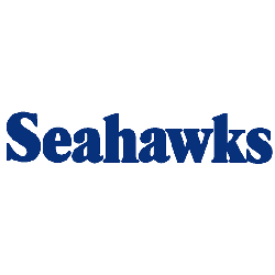
Seattle Seahawks
2012 - Present
Double lined wordmark "SEATTLE" in silver above "SEAHAWKS" in blue below team's primary logo.
Font: Varation of LatinWidD
https://www.wfonts.com/font/latinwidd
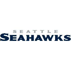
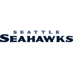
Seattle Seahawks
2012 - Present
Double lined wordmark "SEATTLE" in silver above "SEAHAWKS" in blue.
Font: Varation of LatinWidD
https://www.wfonts.com/font/latinwidd
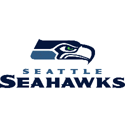
Seattle Seahawks
2002 - 2011
Double lined wordmark "SEATTLE" in silver above "SEAHAWKS" in blue below team's primary logo.
Font: Varation of LatinWidD
https://www.wfonts.com/font/latinwidd
Seattle Seahawks
2002 - 2011
Double lined wordmark "SEATTLE" in teal above "SEAHAWKS" in blue.
Font: Varation of LatinWidD
https://www.wfonts.com/font/latinwidd
Seahawks Wordmark logo Changes Over the Years
The current Seattle Seahawks logo wordmark uses sleek, sharp lettering with a modern edge. Compared to the seattle seahawks logo old version, it feels more assertive. You can compare it with their primary logos here. Also, visit the official team page for branding resources and media.
The wordmark has seen subtle font updates while preserving its legacy. The original Seattle Seahawks logo featured a thicker, block-style design. These updates show how branding evolves thoughtfully.