Seattle Seahawks
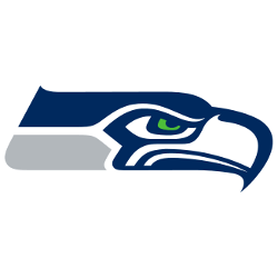
The new logo replaces the Seahawk blue with wolf grey. The Seattle Seahawks logo is comprised of the face of a sea hawk with the eyes, beak and the neck artistically illustrating the team’s quest for glory, pride and success. The fierce glare in the eyes of the Seattle Seahawks logo is basically derived from the Egyptian mythology where a falcon enjoyed a superior place in the hieroglyphs.

Seattle Seahawks
2002 - 2012
On March 1, 2002, the logo was heavily redesigned to coincide with the team moving to the NFC. The logo was designed by NFL Properties' in-house design team. The colors were modified to a lighter "Seahawks Blue", a darker "Seahawks Navy" and lime green piping. The logo artwork was also subtly altered, with an arched eyebrow and a forward-facing pupil suggesting a more aggressive-looking bird.
The mask that inspired the Seahawks logo
During the past few years, people have been speculating about the design influence for the Seattle Seahawks team logo, but until recently the fact that the mask that inspired the designers had been publicly identified in a 1975 Newspaper article had been forgotten.
At the time of the 1975 logo design, the central and northern Northwest Coast art (traditional to the Tlingit, Haida, Tsimshian and Kwakwaka’wakw tribes of Alaska and northern British Columbia) were the most readily recognized design styles from the Pacific Northwest Coast.

Seattle Seahawks
1971 - 2002
When the Seahawks debuted in 1976, the team's logo was a stylized royal blue and forest green osprey's head based on Northwestern tribal art.
Evolution of the Seattle Seahawks Primary Logo
The Seattle Seahawks logo debuted in 1976 with a striking blue and green design rooted in Native American art styles. The Seattle Seahawks logo old was updated in 2002 with sharper lines and deeper colors, enhancing the bird’s eye and beak for a more aggressive look. The complete Seattle Seahawks logo history reflects the franchise’s growth and brand evolution. To explore older marks, visit the Seattle Seahawks alternate logo page.
Today, the Seattle Seahawks logo is instantly recognizable on helmets, jerseys, and across digital platforms. The emblem's angular shapes and Pacific-inspired theme symbolize motion, precision, and identity. Fans of the original Seattle Seahawks logo still appreciate its roots, while the current design keeps the brand fresh and bold. As one of the NFL’s most visually dynamic emblems, it connects deeply with the region. For team news and branding, visit the Seahawks’ official website.
Football Sports Fan Products
