The Cleveland Browns logo wordmark uses a plain, bold typeface in all caps. It’s usually displayed in orange, brown, or white. The font style is straightforward—reflecting the team's tough, traditional identity. This wordmark stands alone without flashy design, much like the team itself. The design remains consistent across decades, tying into the minimalistic approach of the Cleveland Browns logo history and branding.
Cleveland Browns
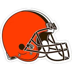
The updated helmet logo is reflective of today’s modern Cleveland, the design honors the past while evolving into the future. The iconic brown and white stripes stand tall over the orange helmet, a new orange color that matches the passion of the Dawg Pound. The new brown face mask represents the strength and toughness of Cleveland.

Cleveland Browns
2015 - Present
Double-lined wordmark "CLEVELAND BROWNS" in brown.
Font: Custom
Cleveland Browns
2015 - Present
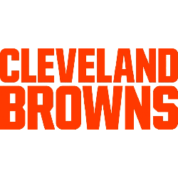
Double-lined wordmark "CLEVELAND BROWNS" in orange.
Font: Custom
Cleveland Browns
2006 - 2014
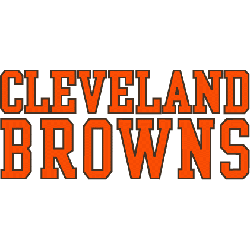
Double-lined wordmark "CLEVELAND BROWNS" in orange with brown outlines.
Font: Custom
Cleveland Browns
2003 - 2005
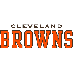
Double-lined wordmark "CLEVELAND" in brown on top and "BROWNS" in orange with brown outline on the bottom.
Font: Custom
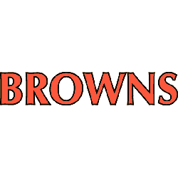
Cleveland Browns
1972 - 2002
Single lined wordmark "BROWNS" in orange with a brown outline.
Font: Custom
Cleveland Browns Logo Wordmark Style Over Time
The wordmark version of the Cleveland Browns logo hasn’t changed much. It continues to embrace a timeless and durable look. Older versions leaned into a slightly more rounded font, while modern ones keep it sharp and narrow. You can compare designs over time on our Cleveland Browns primary logo page.
Designers often reference Cleveland Browns logo pictures and pull from the Cleveland Browns vintage logo collection for retro-themed content. For brand guidelines and current updates, visit the Browns’ official website.