The Atlanta Falcons logo is a bold symbol of strength and speed, perfectly reflecting the team’s fierce identity. Introduced in 1966 and modernized over the years, the Atlanta Falcons logo history showcases a sleek evolution that fans proudly recognize. Today’s design features a stylized falcon in mid-attack, forming an "F" shape.

Atlanta Falcons
The Atlanta Falcons team identity launched a new era for the team in 2003. The logo was redesigned with red and silver accents to depict a more powerful, aggressive falcon, which now more closely resembles the capital letter “F.” The new Falcon logo looks similar, but the Falcon has a swifter, “in flight” look.
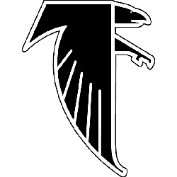
Atlanta Falcons
1990 - 2003
In 1990, the Falcon's removed the red outline for a black outline around the falcon. The black falcon is facing and flying to the right.

Atlanta Falcons
1966 - 1990
The original Atlanta Falcon logo is a black with a white outline falcon crest, outlined in red, forming the letter "F." The falcon is facing to the right.
Evolution of Atlanta Falcons Logo
The Atlanta Falcons logo represents power, speed, and determination, aligning with the team’s fierce persona on the field. Since its debut in 1966, the logo has undergone significant updates while maintaining its core identity. The modern falcon design, shaped like an “F,” emphasizes motion and aggression. Fans admire this unique symbol, which connects deeply with team spirit. Searching for the Atlanta Falcons logo PNG offers easy access to this powerful emblem for digital use.
The Atlanta Falcons logo history reflects the team’s growth and changing eras. From its original red and black design to today’s sharper, more dynamic look, each version tells a story of evolution and pride. Designers carefully crafted each update to resonate with fans and reflect the franchise’s values. For creative projects or merchandise, the Atlanta Falcons logo vector provides high-quality, scalable graphics of this iconic and enduring NFL symbol.
Football Sports Fan Products
