Las Vegas Raiders
In 2020, Las Vegas Raiders have added a black outline to their shield that consists of the wordmark “RAIDERS” at the top, two crossed cutlasses with handles up and cutting edge down, and superimposed head of a Raider wearing a football helmet and a black eye patch covering his right eye.
Raiders Primary Logo
The Las Vegas Raiders’ primary logo has a long and storied history that dates back to the team’s inception in 1960. The original design featured a white shield with two crossed swords, an interlocking “LV”, and the words “Las Vegas Raiders.” This logo was used until 1961 when it was replaced by one featuring a pirate-like figure wearing an eye patch on his left eye along with two crossed swords behind him. This version of the logo lasted until 1964 when it was changed again to feature just the letters “RAI,” which stood for Raiders Athletics Incorporated (the team's corporate name at that time).
In 1966, another change came about as now only one sword appeared in front of what looked like either flames or lightning bolts surrounding them. A few years later this design evolved into its current form: two crossed swords underneath a football helmet outlined by silver and black stripes representing both sides of their fan base who were located all over California at that time. The iconic shield shape remained unchanged throughout these various iterations but additional elements such as stars have been added since then to give it more depth and character.
Today, nearly sixty years after its initial conception; Las Vegas Raiders' primary logo is still instantly recognizable around the world due largely in part because they have kept true to their roots while also evolving over time so much so that even if you don't know anything about American Football or sports teams from Nevada - chances are you can pick out this particular emblem right away! It stands proud across jerseys worn every Sunday during NFL season; reminding us all why we love our favorite teams no matter where they play their games – home sweet home!
Oakland Raiders
1964 - 1981, 1995 - 2019
The Raiders logo continued as a shield that consists of the wordmark "RAIDERS" at the top, two crossed cutlasses with handles up and cutting edge down, and a superimposed head of a Raider wearing a football helmet and a black eye patch covering his right eye.

Los Angeles Raiders
1982 - 1994
A shield that consists of the wordmark "RAIDERS" at the top, two crossed cutlasses with handles up and cutting edge down, and a superimposed head of a Raider wearing a football helmet and a black eye patch covering his right eye.
No changes to the logo that accompanied the team to Los Angeles.
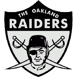
Oakland Raiders
1962 - 1963
Al Davis scrapped the black and gold color scheme for a sleeker, sexier silver and black look, and spiced up the logo adding the wordmark “THE OAKLAND RAIDERS” to the top and crossed swords in behind the likeness of actor Randolph Scott, the man whom the Raider pirate is modeled after and an actor famous for his many star turns in Western films in the 1950’s.
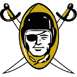
Oakland Raiders
1960 - 1962
The new owner’s created a logo for their newly minted Raiders, a pirate wearing a football helmet with an eye patch on a gold football background. Two white swords in black trim with gold handles criss cross behind the football.
Football Sports Fan Products

All Raiders Fans: Time to Cast Your Vote
Click to go to NFL Logo Battle and vote
Discovered the HIDDEN MEANING Behind the Las Vegas Raiders Logo
The Las Vegas Raiders logo is steeped in rich history and hidden meanings that reflect the team's rebellious spirit and tenacity. Initially established in Oakland in 1960, the Raiders have undergone several relocations, ultimately settling in Las Vegas in 2020. The logo features a pirate figure, which symbolizes the audacious and fearless nature of the team, drawing inspiration from ancient sea raiders.


