The Las Vegas Raiders logo wordmark delivers a sharp, no-nonsense design that mirrors the team’s fearless image. With bold, uppercase letters and tight spacing, it creates instant impact. Often seen on gear and media, it reinforces the Raiders’ tough brand. Though updated visually over time, it remains deeply connected to the franchise’s roots and raiders logo history.
Las Vegas Raiders
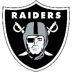
In 2020, Las Vegas Raiders have added a black outline to their shield that consists of the wordmark “RAIDERS” at the top, two crossed cutlasses with handles up and cutting edge down, and superimposed head of a Raider wearing a football helmet and a black eye patch covering his right eye.
Las Vegas Raiders
2020 - Present
Double-lined wordmark "LAS VEGAS RAIDERS" in black.
Font: Twentieth Century MT Ultrabold
https://fontslogo.com/oakland-raiders-logo-font/

Las Vegas Raiders
2020 - Present
Wordmark "RAIDERS" in black.
Font: Twentieth Century MT Ultrabold
https://fontslogo.com/oakland-raiders-logo-font/

Las Vegas Raiders
2020 - Present
Wordmark "LAS VEGAS RAIDERS" in black.
Font: Twentieth Century MT Ultrabold
https://fontslogo.com/oakland-raiders-logo-font/
Las Vegas Raiders
2020 - Present
Double lined wordmark "LAS VEGAS RAIDERS" in silver.
Font: Twentieth Century MT Ultrabold
https://fontslogo.com/oakland-raiders-logo-font/
Las Vegas Raiders
2020 - Present
Wordmark "LAS VEGAS RAIDERS" in silver.
Font: Twentieth Century MT Ultrabold
https://fontslogo.com/oakland-raiders-logo-font/
Discovered the HIDDEN MEANING Behind the Las Vegas Raiders Logo
The Las Vegas Raiders logo is steeped in rich history and hidden meanings that reflect the team's rebellious spirit and tenacity. Initially established in Oakland in 1960, the Raiders have undergone several relocations, ultimately settling in Las Vegas in 2020. The logo features a pirate figure, which symbolizes the audacious and fearless nature of the team, drawing inspiration from ancient sea raiders.
Las Vegas Raiders Logo Wordmark and Visual Identity
The Las Vegas Raiders logo wordmark uses a heavy sans-serif font. This strong typeface gives the logo power and stability. Often paired with the iconic shield, it adds balance to the brand. While other elements have evolved, the wordmark has stayed consistent. To see how it pairs with the main crest, visit the Las Vegas Raiders primary logo page.
Across digital, print, and merchandise, the wordmark stands firm. It’s commonly featured in las vegas raiders logo png files and official las vegas raiders logo images. Its clarity ensures brand recognition in every format. Even when used alone, it holds its identity. For up-to-date visuals and design use, visit the team’s official website.


