The Washington Redskins logo was known for strong symbolism and deep cultural references. Alternate versions over the years included different poses of the Native American profile, updated feather styling, and changes in border detail. While controversial today, these designs were once iconic. Every version reflected a different era in Washington Redskins logo history and its evolving presence in professional football.

Washington Redskins
1983 - 2019
The current version of the Washington Redskins logo features a simplified, modernized form of the native American head inside a yellow circle, with two feathers attached to it. This logo is the same logo as the 1972 logo.
Washington Redskins
2009 - 2020
Stylized yellow letter "R." The letter "R" stands for redskins.

Washington Redskins
2004 - 2008
Stylized burgundy letter "R" with yellow trim. The letter "R" stands for redskins.

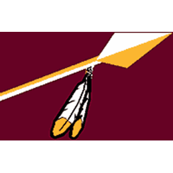
Washington Redskins
1965 - 1969
White and gold arrow with white and yellow feather on a maroon background.
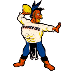
Washington Redskins
1960 - 1965
A Native American passing a football. The native American is dressed in blue pants, orange boots, two blue feathers and cream shirt with the wordmark "REDSKINS" in blue.
Washington Redskins Logo History and Alternate Versions
Several alternate versions of the Washington Redskins logo appeared across jerseys, sideline gear, and commemorative merchandise. Some used darker outlines or simplified colors, while others emphasized heritage through sharper details. You can compare these designs on our Washington Commanders primary logo page.
Many sports historians and collectors still reference the old Washington Redskins logo for its design influence. Files like Washington Redskins logo PNG are often used in retrospectives or visual archives. Whether for context or design study, each version offers insight into how the franchise once presented itself. For current team branding, visit the Commanders' official website.
Football Sports Fan Products