
St. Louis Cardinals
1970 - 1987
In 1970 the logo came to be what is today the streamlined version of the a cardinal head with an attitude.
Designed by Verlander Design.
Cardinals Primary Logo
The St. Louis Cardinals have a long and storied history in the National Football League, dating back to their inception in 1960. The team has undergone several logo changes over the years, each one reflective of the changing times and attitudes within football culture and society as a whole.
The original logo for the Cardinals was inspired by an old-timey baseball design, featuring two birds perched atop a shield with three stars above it representing Arizona, Missouri, and Illinois—the states that make up St. Louis’ metropolitan area at that time (1960), particularly in relation to the St. Louis Cardinals Alternate logo. The colors used were red on white which is still seen today though they have since adopted black into their color scheme. This logo remained unchanged until 1988 when it underwent its first significant redesign; this new version featured only one bird instead of two but kept many of its original elements, including the shield shape along with the red/white/black color scheme while adding some more modern touches such as sharper lines around edges to give it more detail overall look.
In 2005 another update was made to keep up with current trends; this time taking away much of what had been previously seen from previous designs, such as eliminating most details from the inside shield leaving just an outline behind & replacing the bird silhouette with a single feather instead of giving off a much cleaner appearance than before. In addition, the bright yellow hue added background helped bring out other colors and better contrast against them, making an even bolder statement about the team's identity, all while maintaining the classic feel of established logos past decades prior. Even today, after multiple iterations, the basic idea remains the same: a full iconic image represents not just the city itself but also the spirit, determination, and perseverance embodied by every fan who cheers the squad during season games alike - something will always be true no matter how times may change moving forward!
St. Louis Cardinals
1962 - 1970
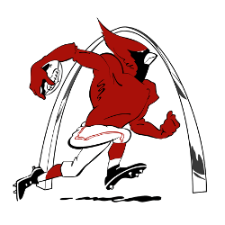
In 1960 the Cardinals logo changed to a red muscled Cardinal carrying a football in football uniform running past the St. Louis Arch.
St. Louis Cardinals
1960 - 1962
In 1960 the Cardinals logo changed to a red muscled Cardinal carrying a football in a football uniform running.