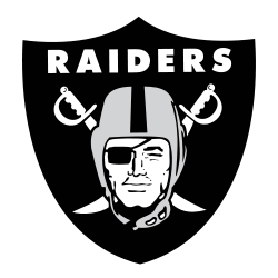
The Oakland Raiders logo stood out with a pirate inside a shield and two crossed swords behind him. It reflected the team's rough, fearless image. Over decades in Oakland, the design stayed largely the same—earning recognition as one of the NFL’s most iconic and enduring visual identities.
Oakland Raiders
1995 - 2019
The Raiders logo continued as a shield that consists of the wordmark "RAIDERS" at the top, two crossed cutlasses with handles up and cutting edge down, and superimposed head of a Raider wearing a football helmet and a black eye patch covering his right eye.

Oakland Raiders
1995 - 2019
Single lined wordmark "RAIDERS" in black.
Font: Twentieth Century MT Ultrabold
https://fontslogo.com/oakland-raiders-logo-font/

Oakland Raiders
1995 - 2019
Single lined wordmark "RAIDERS" in silver.
Font: Twentieth Century MT Ultrabold
https://fontslogo.com/oakland-raiders-logo-font/
Oakland Raiders
1972 - 1981
Single lined wordmark "RAIDERS" in black.
Font: Twentieth Century MT Ultrabold
https://fontslogo.com/oakland-raiders-logo-font/
Oakland Raiders Logo History
The Oakland Raiders logo kept a classic look for years, with subtle updates that preserved its original feel. Its tough identity helped define the franchise. You can see more of its timeline on the Raiders Pro Football Reference page.
While the older Oakland Raiders primary logo was less refined, the newer version sharpened its lines without changing the core elements. The pirate, swords, and shield all remained intact, securing the Oakland Raiders new logo a place in NFL logo history.

