Oakland Raiders
1964 - 1981, 1995 - 2019
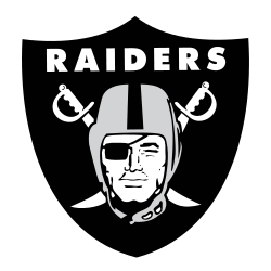
The Raiders logo continued as a shield that consists of the wordmark "RAIDERS" at the top, two crossed cutlasses with handles up and cutting edge down, and superimposed head of a Raider wearing a football helmet and a black eye patch covering his right eye.

Oakland Raiders
1962 - 1963
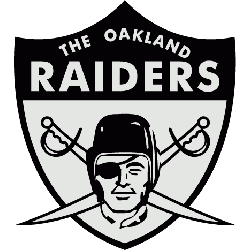
Al Davis scrapped the black and gold color scheme for a sleeker, sexier silver and black look, and spiced up the logo adding the wordmark “THE OAKLAND RAIDERS” to the top and crossed swords in behind the likeness of actor Randolph Scott, the man whom the Raider pirate is modeled after and an actor famous for his many star turns in Western films in the 1950’s.

Oakland Raiders
1960 - 1962
The new owner’s created a logo for their newly minted Raiders, a pirate wearing a football helmet with an eye patch on a gold football background. Two white swords in black trim with gold handles criss cross behind the football.
Evolution of the Oakland Raiders Logo Primary Emblem
The Oakland Raiders logo was first introduced in 1960 and has stayed true to its original design for decades. While slight updates were made over the years, the core look—swords, helmeted figure, and shield—remained intact. Fans can explore older artwork and refinements by visiting our Oakland Raiders Wordmark logo page, where you’ll find legacy visuals from different seasons.
Today, many still use the Oakland Raiders logo PNG for digital projects or throwback collections. The move to Las Vegas brought a new name but didn’t change the visual identity. The Oakland Raiders new logo is essentially the same, honoring the team's deep history. For current branding and official content, visit the Las Vegas Raiders official website. The emblem’s legacy lives on, just like Raider Nation.
"The Legends May Retire, But the Gear is Forever"
History is written on the field, but it’s worn in the stands. From throwback threads to the latest sideline styles, grab your official NFL gear and carry the legacy of your team into the next generation.
Shop the Official NFL Collection
