Milwaukee Bucks
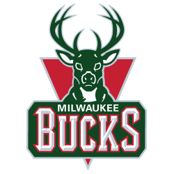
The new Buck is only looking ahead, an imposing figure determined and focused on the path in front of him. An expanded rack (from 8 to 12 points) showing the maturation of the Buck, and underlining the point that he has become an even greater force. The basketball feature in the negative space between the antlers. The M Shape within the chest chevron as an homage to Milwaukee. With hard edges that appear almost cut from metal, and industrial but classic proprietary font juxtaposed against the curvature of the logo represents a symbolic union of urban and rural Wisconsin.
Milwaukee Bucks
2007 - 2015
Before the 2006 - 2007 season, the Bucks unveiled an updated logo and a new color scheme. The basic structure of their previous logo remained the same, but several areas have been enhanced. The wordmark "BUCKS" now includes a more rigid, etched font with a retaining shape to mirror the structure of the letters. The box that outlines the word "BUCKS" was also altered. A "MILWAUKEE" wordmark is above the other wordmark.
Milwaukee Bucks
1994 - 2007
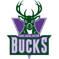
A new logo was first introduced in May of 1993. It depicted an aggressive, frontal view of the head and shoulders of an eight-point white tail buck, a male deer on a triangular purple background. A wordmark "BUCKS" in sliver on a green hunter background and "MILWAUKEE" above in sliver on the purple triangle background. This logo was designed by the Marketing Department of NBA Properties Inc., headed by creative director Tom O'Grady.
Milwaukee Bucks
1968 - 1994
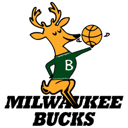
The original logo featured a caricature of a buck wearing a green sweater emblazoned with the letter "B" and spinning a basketball on one hoof while sitting atop the words "MILWAUKEE BUCKS" in black.
Milwaukee Bucks Logo History Exposed: What You Need to Know!
We Unlock the story of Milwaukee Bucks Logo History in this exclusive video! Delve into the evolution, secrets, and surprising revelations surrounding one of the most iconic logos in sports history. Join us as we uncover the journey through time and explore the remarkable legacy behind the Milwaukee Bucks logo. Don't miss out on this enlightening exploration!
How the Milwaukee Bucks Logo Grew
The Milwaukee Bucks logo history began in 1968 with a cartoonish deer. First, the old Milwaukee Bucks logo used green and red. Then, it got sharper lines because fans wanted grit. Now, it’s a sleek stag. Visit the NBA Bucks page for team details.
Basketball Sports Fan Products


