Milwaukee Bucks
The new Buck is only looking ahead, an imposing figure determined and focused on the path in front of him. An expanded rack (from 8 to 12 points) showing the maturation of the Buck, and underlining the point that he has become an even greater force. The basketball feature in the negative space between the antlers. The M Shape within the chest chevron as an homage to Milwaukee. With hard edges that appear almost cut from metal, and industrial but classic proprietary font juxtaposed against the curvature of the logo represents a symbolic union of urban and rural Wisconsin.
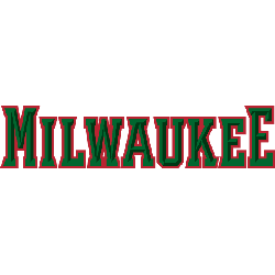
Milwaukee Bucks
2016 - Present
Two lines wordmark "MILWAUKEE" on the top and "BUCKS" on the bottom in green. The "BUCKS" in a larger font.
Font: MKE Block Varsity
https://www.fontspace.com/the-sports-fonts/nba-milwaukee-bucks-2015

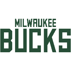
Milwaukee Bucks
2016 - Present
Single line wordmark "MILWAUKEE BUCKS" in green.
Font: MKE Block Varsity
https://www.fontspace.com/the-sports-fonts/nba-milwaukee-bucks-2015
Milwaukee Bucks Logo History Exposed: What You Need to Know!
We Unlock the story of Milwaukee Bucks Logo History in this exclusive video! Delve into the evolution, secrets, and surprising revelations surrounding one of the most iconic logos in sports history. Join us as we uncover the journey through time and explore the remarkable legacy behind the Milwaukee Bucks logo. Don't miss out on this enlightening exploration!