The Los Angeles Rams logo wordmark brings a strong, modern look to the team’s brand identity. It uses all-caps lettering and smooth curves to match the energy of the updated visual style. While designs have shifted through the years, the wordmark still connects to the team’s past. This evolution ties in naturally with the broader los angeles rams logo history.

Los Angeles Rams
Initials “LA” in blue italics with the letter “A” arched back in blue and yellow to form a ram’s horn.
Los Angeles Rams
2020 - Present
Rams primary logo representing the letters "LA" in blue and gold and wordmark "RAMS" in blue.
Font: Custom
Los Angeles Rams
2020 - Present
Triple-lined wordmark "LOS ANGELES RAMS" in blue.
Font: Custom
Los Angeles Rams
2020 - Present
Single-lined wordmark "RAMS" in blue.
Font: Custom
Los Angeles Rams
2017 - 2019
Double lined wordmark “LOS ANGELES” in blue and “Rams” in blue on a white background. The letter “R” is shaped like a ram horns.
Font: The "R" was custom made for their logo, the rest appears to be City Bold Italic by Berthold
https://fontsgeek.com/fonts/City-Bold-Italic
Los Angeles Rams
2017 - 2019
Single lined wordmark "Rams" in blue. The letter "R" is shaped like a ram horns.
Font: The "R" was custom made for their logo, the rest appears to be City Bold Italic by Berthold
https://fontsgeek.com/fonts/City-Bold-Italic
Los Angeles Rams
2016 - 2017
Single lined wordmark "Rams" in blue with a gold background. The letter "R" is shaped like a ram horns.
Font: The "R" was custom made for their logo, the rest appears to be City Bold Italic by Berthold
https://fontsgeek.com/fonts/City-Bold-Italic
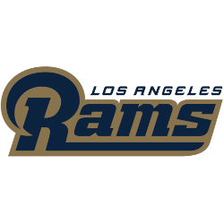
Los Angeles Rams
2016 - 2017
Double lined wordmark "LOS ANGELES" in blue and "Rams" in blue with a gold background. The letter "R" is shaped like a ram horns.
Font: The "R" was custom made for their logo, the rest appears to be City Bold Italic by Berthold
https://fontsgeek.com/fonts/City-Bold-Italic
Los Angeles Rams Logo Wordmark and Visual Identity
The Los Angeles Rams logo wordmark uses a clean sans-serif font. Its curved lettering feels modern yet professional. Often, it appears beside the main ram horn icon to complete the visual system. Although the old Los Angeles Rams logo looked quite different, the wordmark evolved gradually to maintain consistency. To see this transformation, visit the Los Angeles Rams primary logo page.
Today, the wordmark appears on apparel, broadcasts, and social media graphics. It’s widely used in digital formats, especially in los angeles rams logo png versions. Fans recognize it instantly, even when used alone. This clean and flexible wordmark continues to reflect the team’s identity. For official branding materials, visit the team’s official website.

