The Houston oilers logo wordmark had a bold, all-caps design with thick, squared letters and clean angles. It perfectly captured the toughness and spirit of Houston's football identity. Though the team no longer exists, this simple yet strong wordmark remains a favorite among fans and collectors.

Houston Oilers
1980 - 1996
The final logo for the Oilers is a clean blue oil derrick with a white background and a red outline.

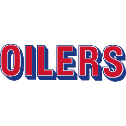
Houston Oilers
1980 - 1996
Wordmark "OILERS" in light blue, white and red.
Font: Custom
Houston Oilers
1972 - 1979
Wordmark "OILERS" in dark blue, white and red.
Font: Custom
Houston Oilers
1968 - 1971
Single lined wordmark "OILERS" in dark blue.
Font: Custom
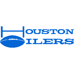
Houston Oilers
1960 - 1971
Double lined wordmark "HOUSTON OILERS" in blue with the letter "H" shaped like goalposts and a football in place of the letter "O."
Font: Custom
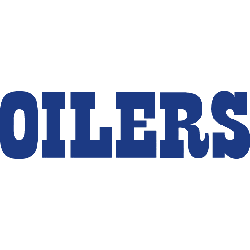
A Bold Wordmark That Left Its Mark
The Oilers' wordmark featured a solid sans-serif typeface, often in red or blue, that aligned with the team’s color scheme. It stood out on jerseys, helmets, and merchandise during the team’s active years. Compared to the old Houston oilers logo that included an oil derrick, this version focused only on typography.
The Houston oilers logo png is still widely shared among nostalgic NFL fans and collectors. The Oilers may have relocated, but their branding still lives on in throwback gear and NFL history books. For more about their original designs, visit the Houston Oilers primary logo page. You can also explore legacy stats and visuals on Pro Football Reference.