The Houston Oilers logo is one of the most recognizable in NFL history. Featuring a tall, red-and-blue oil derrick, it symbolized Texas pride and power. The design stayed mostly the same throughout the team’s years in Houston from 1960 to 1996. Fans still admire the old Houston Oilers logo, often seen on retro jerseys and throwback merchandise that honor this classic era.

Houston Oilers
1980 - 1996
The final logo for the Oilers is a clean blue oil derrick with a white background and a red outline.
Houston Oilers
1972 - 1980
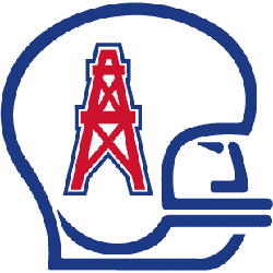
In 1972, the logo did not change except the color that was added. The football player's helmet is in a thick blue and the oil derrick is red with a blue border.

Houston Oilers
1969 - 1972
In 1969 the Oiler's revealed their classic "oil derrick logo." The logo featured a lined drawing of a football player's helmet with a oil derrick on the side. A thick black lined is used to create the logo.

Houston Oilers
1961 - 1969
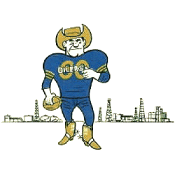
A new variation of Houston's first logo, now a oil man with an oil hat and cowboy boots holding a football in front of an oil field.
Houston Oilers
1960 - 1961
The original Oilers logo is an man wearing a blue uniform and a gold cowboy hat and gold boots in front of an oil field.
Houston Oilers Logo History and Lasting Legacy
The Houston Oilers logo history began in the AFL’s first season. It stood out immediately with its bold, clean design. Over time, only slight updates were made to the shape and colors. You can view rare versions and stylized art in our Houston Oilers Wordmark logo archive, which preserves the brand's evolution.
The team became the Titans in 1999, the oil derrick remains a fan favorite. The Houston Oilers logo PNG is still widely used in fan art and vintage gear. The brand left a permanent mark on the league. From tough matchups to iconic uniforms, the Houston Oilers logo will always represent an unforgettable chapter of NFL history. For today’s team updates, visit the Tennessee Titans official site.