The Denver Broncos logo wordmark features bold, uppercase lettering with clean lines and a forward-leaning stance. Typically shown in navy or orange, it matches the energy of the team’s visual identity. While most fans recognize the leaping horse emblem, the wordmark is equally important. Over time, its minimal changes reflect stability in branding. This design remains a reliable part of the Denver Broncos logo family.
Denver Broncos
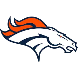
A profile of a white and navy blue highlighted horse’s head with a navy blue outline and an orange mane. The shade of orange was darkened and the navy blue was adjusted slightly as well. Designed by Nike
Denver Broncos
1997 - Present
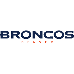
Double-lined wordmark "DENVER" in orange and a smaller font below the other wordmark "BRONCOS" in navy blue.
Font: Denver Broncos Custom
https://fontmeme.com/fonts/denver-broncos-custom-font/
Denver Broncos
1968 - 1996
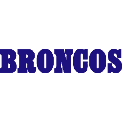
Single lined wordmark "BRONCOS" in blue.
Font: Denver Broncos Custom
https://fontmeme.com/fonts/denver-broncos-custom-font/
Denver Broncos Logo History: From Past to Present! Broncos logo Highlights!
Explore the journey of the Denver Broncos logo, from its early beginnings to the modern design we recognize today! In this video, we take you on a visual tour through the history of the Broncos logo, highlighting the key changes and moments that shaped its evolution.
Denver Broncos Logo Wordmark Style and Evolution
The current wordmark style in the Denver Broncos logo system complements the fast-moving horse icon. While the font has seen minor updates, the athletic and confident look has stayed intact. You can compare updates on our Denver Broncos primary logo page.
Designers often pair the wordmark with the Denver Broncos NFL logo, or use it separately in banners, print, and merchandise. High-quality versions, such as Denver Broncos logo PNG files and Denver Broncos classic logo designs, help maintain visual consistency. Visit the Broncos’ official site for official brand materials.
Football Sports Fan Products