Denver Broncos
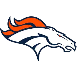
A profile of a white and navy blue highlighted horse’s head with a navy blue outline and an orange mane. The shade of orange was darkened and the navy blue was adjusted slightly as well. Designed by Nike
Denver Broncos
1999 - 2002
A profile of a white and navy blue highlighted horse’s head with a navy blue outline and an orange mane.
A new shade of orange on this logo is lighter.
Designed by Nike.
Denver Broncos
1997 - 1999
The Broncos radically changed their logo in 1997, a design that the team continues to use to this day. The new logo was unveiled on February 4, 1997. Navy blue replaced royal blue on the team’s color scheme. The current logo is a profile of a white horse’s head with a navy blue outline, with an orange mane and navy blue outlines.
The first Nike-heavy design to hit the NFL.
Denver Broncos
1993 - 1997
In 1993, the white horse had a different black outline and facial features. The large orange "D" is the same as the last logo.
Denver Broncos
1970 - 1993
The logo was redesigned so that a white horse is coming out of a large orange letter “D.” The horse has seam coming out of his nose.
In a letter written in 1968, the Broncos organization thanks Pat Taylor’s father, Edwin Taylor: “To Edwin G Taylor, we thought you would be pleased to know that the design suggestion you forwarded to us last year has been accepted as the new Denver Bronco helmet ornamentation. The Denver Broncos were looking for an update to their logo.
“I mean here’s this Bucking Bronco that looks like its emaciated, I mean yeah and they played the way their emblem looked,” said Pat of the even older Broncos logo that featured a orange bucking horse with a football player in an orange uniform riding him.
Taylor delivered that update. “That’s what he came up with. The stallion, the power,” said Pat. Taylor had one day sketched the now iconic D and sent the idea to the team. For what could be considered one of his greatest creations, Taylor received that letter from the team, a shirt, hat and two tickets in the south stands for a game against the Kansas City Chiefs. Tickets that Taylor never used.
Denver Broncos
1962 - 1970
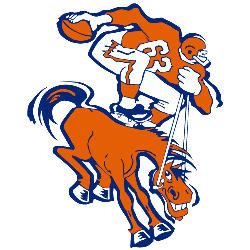
Two years later, the team unveiled a new logo featuring a orange bucking horse with a football play in a orange uniform holding a football, and changed their team colors to orange, royal blue and white.
Denver Broncos
1960 - 1962
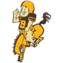
When the Broncos debuted in 1960, their original logo drew as much attention as their play on the field. They featured white and mustard yellow logo as a football player riding a yellow bucking bronco.
Denver Broncos Logo History: From Past to Present! Broncos logo Highlights!
Explore the journey of the Denver Broncos logo, from its early beginnings to the modern design we recognize today! In this video, we take you on a visual tour through the history of the Broncos logo, highlighting the key changes and moments that shaped its evolution.
THE BEST Denver Broncos Logo Designs EVER!
The Denver Broncos have showcased a remarkable array of logo designs throughout history, each reflecting the team's evolving identity and the spirit of its passionate fan base. From the original design featuring a fierce-looking bronco in 1960 to the sleek...
History and Modern Use of the Denver Broncos Logo
The Denver Broncos logo has transformed significantly since the team's founding in 1960. The current design, introduced in 1997, showcases a modern, aggressive bronco head, replacing the more cartoonish earlier versions. This shift marked a new era for the franchise, aligning with a winning culture. A look back at the Denver Broncos classic logo highlights its retro charm, which fans still appreciate on throwback apparel and commemorative merchandise.
For digital and creative projects, the Denver Broncos logo PNG format is ideal for high-quality, transparent visuals. It’s perfect for web design, fan pages, or custom graphics. Meanwhile, the Denver Broncos NFL logo continues to appear across all official branding, from uniforms to stadium graphics. Visit our Broncos logo gallery to explore various formats and versions. No matter the era, the logo embodies the Broncos’ competitive spirit and loyal fan base.
Football Sports Fan Products
