Chicago Cardinals
1947 - 1959
Starting in 1947, the Cardinal's logo is a brown and black cardinal perched on the stitches of a white with black outline football.
Chicago Cardinals
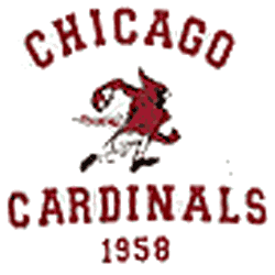
1958 - 1959
A red running Cardinal between wordmark "CHICAGO CARDINALS 1958" in red.

Chicago Cardinals Logo History
The Chicago Cardinals logo history includes several alternate designs created for different eras. These Chicago Cardinals alternate logo versions often adjusted color shades, lettering, and mascot styling. As a result, each Chicago Cardinals old logo highlights how the team adapted its look while maintaining a recognizable identity.
Over time, the Chicago Cardinals logo history shows a clear shift toward cleaner and more consistent branding. Many Chicago Cardinals alternate logo designs were simplified for uniforms and merchandise. Still, every Chicago Cardinals old logo preserved the franchise’s historic red cardinal imagery.
Today, the full Chicago Cardinals logo history offers fans a complete visual timeline. This archive includes every Chicago Cardinals alternate logo from start to finish. Visit the Chicago Cardinals Wordmark Logo page to see lettering-based designs, or refer to the Chicago Cardinals Wikipedia page for official team history.


