Carolina Panthers
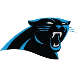
The head of the panther in Carolina Panthers logo is black and silver in color, sketched in blue. The emblem depicts that the Panthers are expert hunters and attack their rivals at the final stage. The team changes were designed to give their logo an “aggressive, contemporary look” as well to give it a more three-dimensional feel.

Carolina Panthers
1995 - 2012
The original Panther logo is a stylish black panther with a blue trim. The panther is a 3/4 view with silver face features. The mouth of the panther has jagged teeth.
The Evolution of the Carolina Panthers Logo
The Carolina Panthers logo has maintained its core design since the team's founding, with only minor refinements to enhance its sleek, aggressive look. The sharp lines and bold colors reflect the team’s fast and fearless style. Looking back at the Carolina Panthers logo history, fans appreciate how the logo has remained consistent while embracing modern design elements. It's a visual identity that resonates deeply across the NFL and with Panthers fans everywhere.
For collectors and longtime supporters, the Carolina Panthers vintage logo offers a nostalgic look at the team’s early branding. These retro designs showcase the franchise’s roots and its rise in the NFL. On the other hand, today’s high-quality Carolina Panthers logo pictures are perfect for digital use, social media, and fan gear. Whether you prefer the vintage style or modern edge, the Panthers' logo remains a bold symbol of team pride and legacy. To learn more about the evolution of sports team branding, check out the NFL’s official history of team logos.
Football Sports Fan Products
