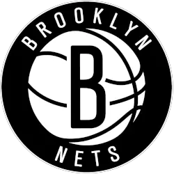
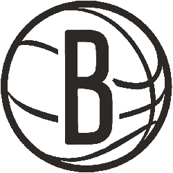
Brooklyn Nets
A black letter “B” on a white basketball with black seams inside a black circle with the wordmark “BROOKLYN NETS” arched around in white.
Brooklyn Nets
2025 - Present
A black letter "B" on a white basketball with black seams.
A slightly update version.
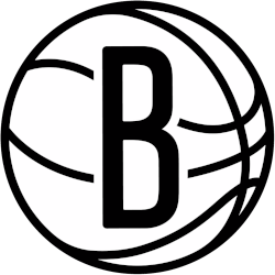
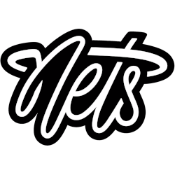
Brooklyn Nets
2025 - Present
A custom scripted wordmark "Nets" in white with black formed background.
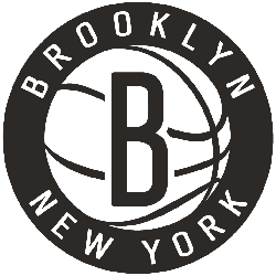
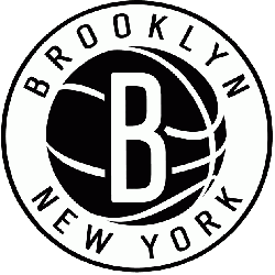
Brooklyn Nets
2013 - 2024
Black "B" on a white basketball in a black circle surrounded by wordmark "BROOKLYN NEW YORK" in white.
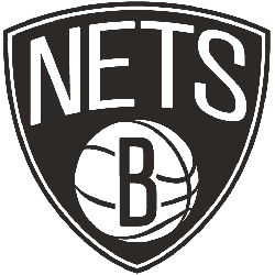
Brooklyn Nets
2013 - 2024
"NETS" in white arched over a white basketball with a black B on it, all within a black shield. The letter "B" represents the city of Brooklyn.
Brooklyn Nets
2013 - 2024
Black letter "B" on a white basketball. The letter "B" represents the city of Brooklyn.
Brooklyn Nets
2013 - 2014
White "B" on a black basketball in a white circle surrounded by wordmark "BROOKLYN NEW YORK" in black.
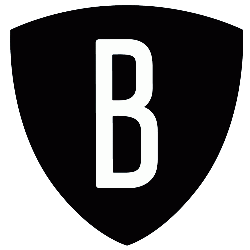
Brooklyn Nets
2013 - 2014
A white "B" on a black shield. The letter "B" represents the city of Brooklyn.
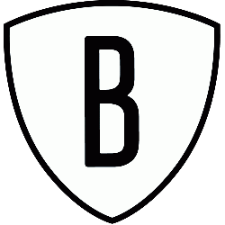
Brooklyn Nets
2013 - 2014
A black letter "B" on a white shield outlined in black. The letter "B" represents the city of Brooklyn.
Brooklyn Nets Logo Evolution That Will SHOCK You!
In the fascinating video Brooklyn Nets Logo Evolution That Will SHOCK You!, viewers embark on a visual journey through the transformation of the Brooklyn Nets' logo over the years. This engaging exploration highlights the key design changes, cultural influences, and branding strategies that have...