The Baltimore colts logo wordmark reflected the team’s energy with italicized block letters. It delivered movement and strength in a simple design. This visual identity stood strong through the franchise’s Baltimore years and still resonates with fans of old-school football branding.
Baltimore Colts
1979 - 1983
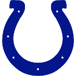
The first horseshoe logo appeared in 1979. The logo is a blue horseshoe with seven small white holes.
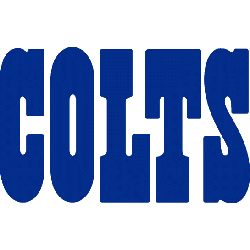
Baltimore Colts
1972 - 1983
Single-lined wordmark “COLTS” written in blue.
Font: Custom
Bold Look of the Baltimore Colts Logo
The Baltimore colts logo wordmark used blue, forward-leaning letters to signal speed and progress. It matched the team’s tough playing style during its time in Baltimore. This design became an icon of early pro football. Check the Baltimore Colts page on Pro Football Reference for more.
Unlike the Baltimore Colts primary logo, which featured a horse and horseshoe, the wordmark leaned on bold typography. The old Baltimore colts logo remains a symbol of grit and tradition in Baltimore colts logo history, capturing a proud chapter in NFL history before the team relocated.