Washington Commanders
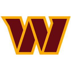
A letter “W” in burgundy with angled serifs and a gold stencil-like outline both within the interior of the W and on its outside.

Washington Football Team
2020 - 2021
Custom font yellow letter "W." The letter "W" represents the city name of Washington D.C.

Washington Redskins
1983 - 2019
The Washington Redskins logo features a simplified, modernized form of the Native American head inside a yellow circle, with two feathers attached to it. This logo is the same logo as the 1972 logo.
Slight changes to the shade of Native American.
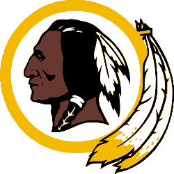
Washington Redskins
1982 - 1983
This "tucked feather" version came about as a result of the decals not properly sticking to the helmets at the lower juncture of the feathers and the outer circle. The following year, the decal manufacturer started using a more flexible material, and the team reverted to the "hanging feather" version of the logo.
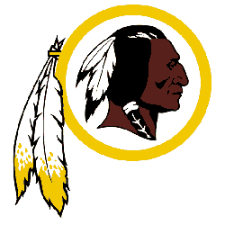
Washington Redskins
1972 - 1982
In 1972, the Redskins removed away from the letter "R" and replaced it with an native American. The circle is now a solid yellow with two feathers hanging. The Native American is brown skinned with black hair and two white feathers.
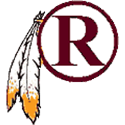
Washington Redskins
1970 - 1972
Vince Lombardi, who coached the Redskins in 1969 before dying during the 1970 pre-season, was the inspiration behind the helmet. Lombardi pushed for the logo, with the letter "R" which sat inside a white circle enclosed within a burgundy circle border, with Indian feathers hanging down from the side, because of its similarity to the "G" on the helmets worn by his Green Bay Packers for many years.
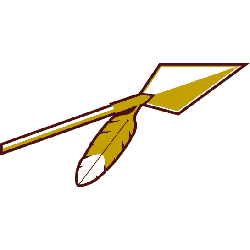
Washington Redskins
1965 - 1970
The Redskins made a major change to their logo in 1965 with the change to an arrow. A white and gold arrow with one feather outlined in the color maroon.
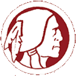
Washington Redskins
1960 - 1965
The 1960 logo for the Redskins, featured a white silhouette of an native American with red outline in a circle with a white banner.
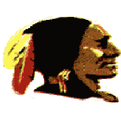
Washington Redskins
1952 - 1960
In 1952 a new design of the native American appeared. Facing to the right, again with black hair and two feathers one yellow and one red.
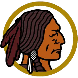
Washington Redskins
1937 - 1952
Native American head facing to the right in black and yellow circle.
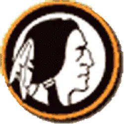
Boston Redskins
1933 - 1936
Native American head in orange circle.

Boston Braves
1931 - 1932
The original logo for the football Boston Braves is the same logo from the baseball Boston Braves as a red Native American with a headdress.
Redesign and Evolution of the Commanders’ Primary Logo
The Washington Commanders logo was introduced in 2022 as part of a full team rebrand. Departing from previous imagery, the current design features a custom “W” in burgundy and gold, with sharp edges and a solid base that represents stability and progression. The NFL Washington Commanders logo also reflects the team’s military-inspired identity. To explore previous branding elements and secondary marks, visit the Washington Commanders alternate logo page.
Today’s Washington Commanders logo appears across uniforms, merchandise, helmets, and digital branding. The high-resolution Washington Commanders logo PNG is especially popular among fans and content creators seeking modern, bold visuals. As outlined in the Washington Commanders logo history, this emblem marks a shift toward unity and professionalism in Washington’s football identity. For official updates, merchandise, and media, visit the Commanders’ website.
Football Sports Fan Products
