Seattle Sonics
2002 - 2008
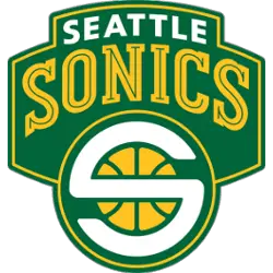
The final Supersonics logo is a white colored "S" representing Seattle and Sonics written on a yellow basketball. The "S" is shaped to be circular so that it covers the ball. The logos is written on a green background which represents the team colors. On top is wordmark "SEATTLE" in white and "SONICS" in yellow with a green line throughout.
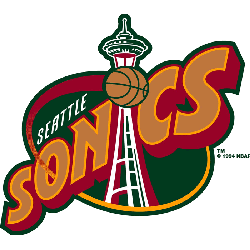
Seattle Sonics
1996 - 2002
The Space Needle is forming the "I" in the wordmark SONICS" on a brown with orange trim and bold font. All of this on a green oval background with red and orange trim and a basketball for the dot in the "I." Also, a wordmark "SEATTLE" in white above Sonics.
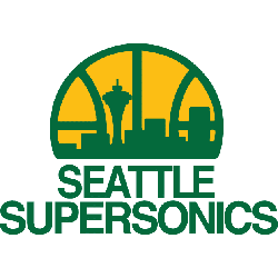
Seattle Supersonics
1976 - 1996
In 1976 the Sonics added a new color to the logo, yellow. The logo featured a basketball with the Seattle cityscape, including the space needle on a yellow background. Below is a wordmark "SEATTLE SUPERSONICS" in green.
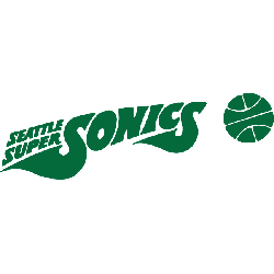
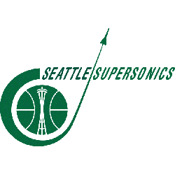
Seattle Supersonics
1972 - 1976
The next Sonic logo again all in green, with a basketball to the right. The wordmark "SONICS" is shaped like a space ship flying with the wordmark "SEATTLE SUPER" above the first "S" in Sonics.
Seattle Supersonics
1971 - 1972
In 1971 the Sonics logo changed to a green basketball with a white outline. A wordmark "Seattle SuperSonics" in the center of the basketball in white lettering.
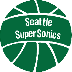
Seattle Supersonics
1968 - 1971
The original SuperSonics logo is an all green logo. The space needle is inside a basketball with a Sonic shuttle flying around the basketball. A wordmark "SEATTLE SUPERSONICS" in green.