Sacramento Kings
The new primary logo closely resembles the team’s original logo created back when the franchise moved from Kansas City to Sacramento in 1985. A wordmark “KINGS” in purple in between a purple crown and a silver basketball. In addition a wordmark “SACRAMENTO” in white above the basketball.
Sacramento Kings
2016 - Present
A purple and silver lion wearing a crown in the shape of a basketball and he is roaring.

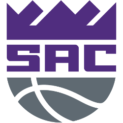
Sacramento Kings
2016 - Present
The letters "SAC" in purple in between a purple crown and a silver basketball. The letters "SAC" stand for the city of Sacramento.
Sacramento Kings
2016 - Present
A very majestic purple lion wearing crown dribbling basketball.
Sacramento Kings
2016 - Present
A very majestic silver lion wearing crown dribbling basketball.

Sacramento Kings
2016 - Present
A purple crown fit for a King.

Sacramento Kings
2015 - 2016
Purple crown with white and black outline.

Sacramento Kings
2015 - 2016
A purple crown fit for a King.

Sacramento Kings
2006 - 2015
Purple crown with silver and black outline.

Sacramento Kings
2003 - 2004
A slanted purple crown with silver and black outline.

Sacramento Kings
1995 - 2014
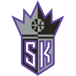
White "SK" inside a black and silver Kings crown shield. The letters "SK" stand for the city and the team nickname Sacramento Kings.