
Sacramento Kings
The new primary logo closely resembles the team’s original logo created back when the franchise moved from Kansas City to Sacramento in 1985. A wordmark “KINGS” in purple in between a purple crown and a silver basketball. In addition a wordmark “SACRAMENTO” in white above the basketball.

Sacramento Kings
1995 - 2016
In 1994, the Kings radically changed their look, adopting a new color scheme of purple, silver, black, and white. The Kings logo comprises of a King's crown with two spears in the background and a purple basketball at the bottom. A wordmark "SACRAMENTO" in white on a purple banner on top and a wordmark "KINGS" in white on a purple background in the center of the logo.
Sacramento Kings
1986 - 1995
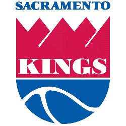
This logo has made the transition to it's third city, Sacramento. Again the red crown on top with the wordmark "KINGS" in white and a blue basketball on the bottom half of the logo. A new wordmark "SACRAMENTO" in blue on top of the logo.
Kansas City Kings
1976 - 1985
The logo of a crown on top and a bottom half of the basketball was also carried over. The wordmark "KANSAS CITY", in blue, was placed above the logo. The wordmark "KINGS", in white, was placed on the crown.

Kansas City-Omaha Kings
1973 - 1976
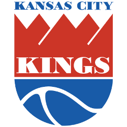
The move to Kansas City, brought the same logo with the team. The red crown with the wordmark "KINGS" in white at the bottom and a blue basketball below the crown. The bottom wordmark is now "KANSAS CITY-OMAHA" in blue.
Cincinnati Royals
1971 - 1972
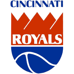
In 1971, the team would adopt a red crown with a blue half-basketball below it. The wordmark "CINCINNATI", in blue, was placed above the logo. The wordmark "ROYALS", in white, was placed on the red crown.
Cincinnati Royals
1958 - 1971
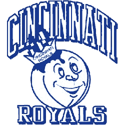
Upon moving to Cincinnati in 1957, the team logo became a basketball with a cartoon face. The basketball was depicted as wearing a crown with the city of Cincinnati within it. The wordmark "CINCINNATI" is featured above the logo while the wordmark "ROYALS" is below. The crown also had the team name on it. This logo is white with blue outlines.
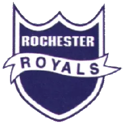
Rochester Royals
1946 - 1957
The initial Rochester Royals logo featured a blue and white shield with the wordmark "ROCHESTER" on the top in white, with a white banner with the wordmark "ROYALS" on it.
The Reign of the Sacramento Kings Logo
The Sacramento Kings logo history began in 1948 as the Rochester Royals. First, the old Sacramento Kings logo used a simple crown. Then, purple and silver took over since fans wanted flair. Now, it’s a sharp design. Visit the NBA Kings page for team details. The Sacramento Kings logo reflects regal pride.
Basketball Sports Fan Products


Kings Enthusiasts: Time to Exercise Your Vote
Click to go to NBA Logo Battle and vote


