Portland Trailblazers
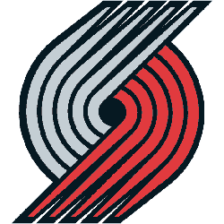
The main change is the swap of the colors in the pinwheel, with red moving up top, and white – instead of silver – going to the bottom. There’s also a slight design change in terms of the angles and the ends of the pinwheel which do look pretty nice.
As for other changes, the font has been updated — there are now serifs on both the “P” and “T” — and the lines are now at a 45 degree angle, which according to the team represents “the 45th Parallel North that leads on a path to the Northwest region.” Anyone who has driven over and over again past that 45th Parallel sign on I-5 in Salem can attest to that.
Portland Trailblazers
2018 - Present
Trail Blazers' featuring their nickname of "ripcity" as an official alternate team logo. The logo has the word "rip" in red and "city" in black.
Portland Trailblazers
2003 - 2017
5 red and 5 silver lines curled into each other. It is a graphic interpretation of two five-on-five basketball teams lined up against each other.
Portland Trailblazers
2003 - 2017
A flaming letter "A" in the wordmark "BLAZE" in red with black outline, scripted for the mascot.

Portland Trailblazers
2003 - 2006
A black with silver seams basketball with wings of fire.
Portland Trailblazers
2003 - 2006
5 red and 5 silver lines curling into each other next to a wordmark "TRAIL BLAZERS" in black with red and silver trim.
Portland Trailblazers
2003 - 2004
A black basketball with wings of fire and a wordmark "BLAZERS" written in white between the wings.

Portland Trailblazers
1991 - 2002
5 red and 5 black lines curling into each other. It is a graphic interpretation of two five-on-five basketball teams lined up against each other.

Portland Trailblazers
1971 - 1990
5 red and 5 black lines curling into each other. It is a graphic interpretation of two five-on-five basketball teams lined up against each other.
