Philadelphia Eagles
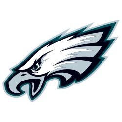
The team’s logo changed in 1996, with the eagle limited to a white bald head, drawn in a more cartoon based style. The eagle has determined and aggressive attack look with mouth open. The logo has a silver border to give it a 3-D look. The current logo has a hidden “E” on the neck of the eagle.

Philadelphia Eagles
1987 - 1996
In 1987 a new and different design of the eagle was introduced. The eagle is now flying right to left, and the green eagle now has a white accent throughout its body and wings. Again carrying a brown football.
Philadelphia Eagles
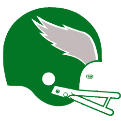
1973 - 1987
A green eagles football helmet with silver and white trim wings.
Philadelphia Eagles
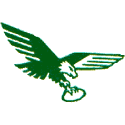
1969 - 1973
A new designed logo was created in 1969. A green eagle carrying a white football. The wings look very similar to wings on a jet.

Philadelphia Eagles
1948 - 1969
From 1948 - 1995, the team logo was an eagle in flight carrying a football in its claws. The design was similar to the Apollo 11 emblem, and its moon-landing craft was dubbed Eagle, players wore the flight's mission patch on their jerseys during 1969.

Philadelphia Eagles
1944 - 1948
A green eagle flying while holding a football in its claws.
New version of the Steagles logo.
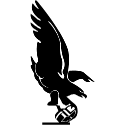
Philadelphia/Pittsburgh Steagles
1943
In 1943, when manpower shortages stemming from World War II made it impossible to fill the roster, the team merged with the Pittsburgh Steelers forming the "Phil-Pitt Eagles" and were known as the "Steagles." The merger, never intended as a permanent arrangement, was dissolved at the end of the 1943 season. The logo is a black eagle grabbing a black helmet.

Philadelphia Eagles
1936 - 1942
A green and white eagle holding a green football while taking off.
Philadelphia Eagles
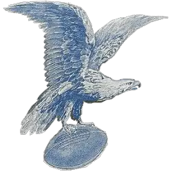
1933 - 1936
Eagles first logo is a blue and white eagle flying grasping a blue football.
Uncovering the Popular Philadelphia Eagles Logo
Attention all Eagles sports fans! Have you ever considered the iconic Philadelphia Eagles logo and what it truly represents?
History Behind the Primary Philadelphia Eagles Logo
The Philadelphia Eagles logo has evolved significantly since the team was founded in 1933. Earlier designs included a full eagle in flight holding a football, while later iterations introduced stylized wings and lettering. The current version, introduced in 1996, modernized the brand with a sleeker eagle head. For a closer look at alternate and historic marks, visit the Philadelphia Eagles alternate logo page, which features rare and iconic visuals.
Fans of the vintage Philadelphia Eagles logo often appreciate its retro charm and bold green coloring, once proudly displayed on helmets and gear. The modern Philadelphia Eagles logo is sharper and widely used across media, apparel, and branding. As part of a rich visual journey in the Philadelphia Eagles logo history, it blends tradition with innovation. For team updates, branding info, and official resources, visit the Eagles’ website.
Football Sports Fan Products
