Our New Orleans Hornets logo wordmark collection highlights the team’s distinctive wordmark designs from its New Orleans era. From its debut to its evolution, learn about New Orleans Hornets logo history, explore New Orleans Hornets basketball ties, and find New Orleans Hornets cap wordmark files, preserving unique designs for fans.
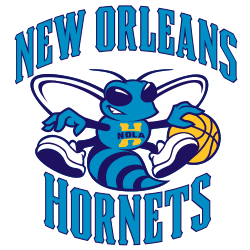
New Orleans Hornets
2009 - 2013
Updated Hugo the Hornet with "NOLA" across its chest. "NEW ORLEANS HORNETS" encompassing Hugo.

New Orleans Hornets
2009 - 2013
Wordmark "NEW ORLEANS" in teal with dark blue trim in an arched pattern.
Font: Custom
New Orleans Hornets
2003 - 2013
Double lined wordmark "NEW ORLEANS" on top and "HORNETS" in aqua with a underline.
Font: Custom
New Orleans Hornets
2003 - 2008
Wordmark arched "NEW ORLEANS" in teal with yellow trim.
Font: Custom
New Orleans Hornets wordmark logos
The New Orleans Hornets logo history began in 2002 after relocating from Charlotte. First, the wordmark featured a bold “HORNETS” script with a hornet graphic. Then, a 2010 teal and red design emerged because fans liked its vibrant update. These logos shaped the team until 2013. Visit the NBA Pelicans page for team details.
Our New Orleans Hornets logo wordmark collection showcases the 2010 teal and red design, a favorite for fans of New Orleans Hornets basketball seeking New Orleans Hornets cap wordmark files. Because it’s iconic, collectors value these logos from the team’s New Orleans years. For the primary design, check our New Orleans Hornets primary logo. Thus, this wordmark logo collection reflects the Hornets’ New Orleans legacy.


