Buzz into our New Orleans Hornets logo collection, showcasing the team’s vibrant Creole spirit. From NBA roots to bold designs, explore New Orleans Hornets logo history, relive New Orleans Hornets basketball pride, and check out New Orleans Hornets cap emblems, celebrating iconic logos for every Hornets fan.
New Orleans Hornets
2009 - 2013
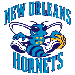
Updated Hugo the Hornet with "NOLA" across its chest. "NEW ORLEANS HORNETS" encompassing Hugo.
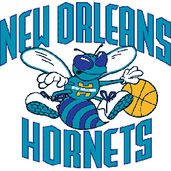
New Orleans Hornets
2003 - 2009
The move to New Orleans brought the same logo with the Hornets. They changed the city name to "NEW ORLEANS" in teal. The hornet is dribbling a lighter orange basketball and "New Orleans" and a yellow "H" on the chest.
The Sting of the New Orleans Hornets Logo
The New Orleans Hornets logo history began in 2002 after relocating from Charlotte. First, the New Orleans Hornets logo featured a teal hornet with a basketball. Then, a 2008 fleur-de-lis design emerged since fans loved local flair. Now, it’s a nostalgic gem. Visit the NBA Pelicans page for team details.
Our New Orleans Hornets logo collection highlights the 2008 fleur-de-lis, perfect for New Orleans Hornets basketball fans. Because it’s iconic, collectors seek New Orleans Hornets logo png files for custom New Orleans Hornets cap designs. Check our New Orleans Hornets alternate logo for rare styles. It captures the team’s Big Easy energy.
Basketball Sports Fan Products