
Skip to content

SPORTS LOGO HISTORY

Sports Logo HistorySports Logo History
  • Logos Type
    • Alternate Logo History
    • Primary Logo History
    • Wordmark Logo History
  • League Logos
    • AAF Logo History
    • ABA Logo History
    • CFL Logo History
    • NCAA Logo History
    • MLB Logo History
    • MLS Logo History
    • NBA Logo History
    • NFL Logo History
    • NHL Logo History
    • NWSL Logo History
    • Premier Logo History
    • UFL Logo History
    • USFL Logo History
    • WNBA Logo History
    • XFL Logo History
  • Logo Battle
  • Logo News
  • More…
    • Logo Videos
      • MLB Sports Videos
      • NBA Sports Videos
      • NCAA Sports Videos
      • NHL Sports Videos
      • NFL Sports Videos
      • Soccer Sports Videos
    • SHG YouTube Channel
      (opens in a new tab)
    • Sports Team History
    • Sports News History
    • Sports Store History
    • Sports Logo History Products
      (opens in a new tab)

Generic selectors
Exact matches only
Search in title
Search in content
Post Type Selectors
Search in posts
Search in pages

Generic selectors
Exact matches only
Search in title
Search in content
Post Type Selectors
Search in posts
Search in pages
Newcastle United New Crest

Newcastle United New Crest: Tradition Meets Modern Design

Newcastle United did not unveil an unfamiliar badge on October 1, 2026. Its castle, seahorses and striped shield remained instantly recognizable. Yet the announcement mattered: the club had chosen to replace a design used since 1988. Its solution was not to erase history, but to make an intricate emblem clearer without losing its character. The decision reflected its city, connecting to the new Newcastle United new crest.

For supporters dreaming of more unforgettable European evenings, Champions League predictions bring an extra spark of anticipation to conversations about Newcastle’s future. The redesigned crest, which includes elements of the new Newcastle United new crest, belongs to that same hopeful outlook, but its roots run deeper. It is intended to travel with the team into a new era while continuing to tell a much older story.

Why a Beloved Badge Needed Attention
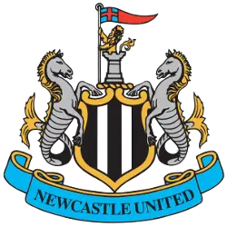
Newcastle United FC Primary Logo 1988 - 2026
Sports Logo History

The previous crest was created for a different media landscape. Its ornate outlines looked impressive on scarves, but small digital displays exposed weaknesses that were easier to overlook decades ago. Individual features could become indistinct on phone screens, television graphics and embroidered fabric. The problem was not that supporters had stopped recognizing the badge. It was that reproducing it consistently had become difficult.

Newcastle began reviewing the issue in 2024. Instead of unveiling a fashionable replacement, officials wanted to learn which parts of the design supporters considered essential. That distinction shaped the project. The goal was better craftsmanship, not a new personality.

Fans Drew the Boundaries

Consultation lasted more than two years and involved surveys, workshops, events, focus groups and discussions with the Fan Advisory Board. The club heard one message repeatedly: improve the familiar badge, but do not turn it into something else. Four in five respondents recognized its practical limitations, while 84% supported updating the existing design rather than beginning again.

Those findings mattered because the emblem carries memories as well as graphics. Supporters see it on childhood shirts, photographs of family trips to St. James’ Park and banners carried through difficult seasons. A simplified circle might have worked neatly on a smartphone, but it would have discarded much of what made the crest distinctive. Designers therefore had to work within clear limits set by fans.

Three Designs, One Clear Winner

Under chief creative officer Kenneth McIver, the design team explored thousands of variations before presenting three final options. The independent company Octagon administered a poll between August 6 and August 27, 2026. Invitations went to 118,658 eligible supporters connected to the club, including ticket holders and members. This was not an unrestricted online vote.

Overall, 27,348 supporters voted. Option C secured 64.8% of first-choice votes, ahead of Option B on 19.0% and Option A on 16.2%. The winner also received majority support within every supporter category reported by the club. Those figures do not speak for every Newcastle fan, but they show a decisive preference among those who participated. The final result gave the designers something invaluable: an identifiable choice made by supporters themselves.

What Changed in the New Crest?
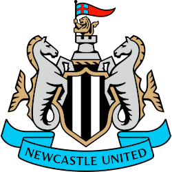
Newcastle United FC Primary Logo 2026 - Present
Sports Logo History

Place the old and new emblems side by side and the similarities stand out first. Both have a castle above a striped shield, paired mythical seahorses, a lion holding a pennon and a blue ribbon with its name. The composition remains intact because supporters specifically asked for those elements to survive.

The improvements are concentrated in the drawing. The castle appears sharper, the shield has been reworked, and the supporting figures have cleaner, more consistent details. The lion, flag and ribbon have also been refined to create stronger alignment. Even line weights received attention, helping the image stay legible at different sizes. It is a technical renovation with an emotional purpose: the badge should still feel like Newcastle when printed on a tiny label or displayed across a stadium screen.

Why the Seahorses and Castle Matter

The design owes much to Newcastle upon Tyne’s coat of arms. The castle recalls the Norman stronghold from which the city takes its name. Two hippocampi, creatures with the front of a horse and the tail of a fish, reflect the area’s maritime connections. They evoke a place shaped by shipping, commerce and the River Tyne. Above the castle, a demi-lion carries a pennon linked to St George.

The football club’s black and white stripes turn this civic symbolism into a sporting identity. Earlier badges followed different paths. A 1976 emblem featured a magpie and the river, while the circular version adopted in 1983 placed a bird inside the lettering. The heraldic design introduced in 1988 returned to the city’s visual history. Newcastle has refined that connection rather than replacing it.

A Different Approach to Football Branding

Many clubs face similar design pressures. Across the Premier League, a crest must work on shirts, mobile apps, television graphics and merchandise sold worldwide. Some organizations respond by reducing details dramatically. Others return to historic imagery, as Chelsea did when it restored a traditional lion-inspired identity in the mid-2000s.

Newcastle chose an unusually restrained middle path. Its new mark aims to be more versatile without becoming interchangeable with the badges of other teams. There was also a formal safeguard: England’s Independent Football Regulator determined in September 2026 that the club had taken reasonable steps to establish majority supporter backing for the material change. That decision concerned the consultation process, not the regulator’s opinion of the artwork.

When Will the New Badge Appear?

The crest will not replace every previous version immediately. Newcastle plans a gradual introduction across signage, digital platforms and broadcasting. The important milestone for shirt buyers comes in the 2027/28 season, when the updated badge is scheduled to appear on match kits. During the transition, supporters may still encounter the familiar 1988 artwork.

Perhaps that is fitting. Football identities gather meaning slowly, through repeated appearances in ordinary and extraordinary moments. Newcastle’s revised crest promises no automatic success on the pitch. What it offers is continuity: the same castle, the same seahorses and the same stripes, drawn more carefully for the years ahead.

The Sports History Network

Explore the evolution of iconic team branding and professional sports legacies across our entire network at the Sports History Group.

Dive deeper into franchise legacies at Sports Team History, catch real-time highlights via Sports News History, or shop for authentic collectibles at Sports Store History.

Newcastle new badgeNewcastle United badgeNewcastle United crestNewcastle United logoNewcastle United new crestNUFC crestNUFC new badge

Sports Logo History Newsletter

Sign up for our newsletter to get the latest sports logo updates delivered directly to your inbox!

Sports History Group Videos

Sports History Group Videos

Sports News History

Sports News Worth Knowing

RSS feed: Headline News Headline News

  • Vancouver Whitecaps FC vs. San Diego FC | Full Match Highlights | Brian White 100TH MLS GOAL!!
  • Tanner Jeannot and Nicolas Deslauriers get into a crazy heavyweight fight #nhl #hockey
  • Miami Heat vs Dallas Mavericks Full Game Highlights – October 26, 2026 | NBA Season
  • Top 6 Good Sportsmanship Moments in MLB #baseball #mlb
  • SOPHIE defends ANGEL REESE getting MAD over NOT GETTING THE BALL #WNBA #wnbaplayoffs #wnbafinals

Advertisement

Sports Market History

Sports Team Marketplace of Champions!

SLH News

"Latest Sports Logo History News"

Newcastle United New Crest: Tradition Meets Modern Design

October 29, 2026

Meet the Rhode Island Breakers: The UFL’s Only Northeast Team Gets Its Name

October 27, 2026

Los Angeles Hosts Its Ninth Super Bowl, and the Logos Show How the Game Has Changed Since 1967

October 27, 2026

When Did Each NFC North Team Last Update Their Logo?

October 21, 2026

New Jersey Has the Teams, but Not Always the Name

October 21, 2026

The Eagle and the Glass: What Keeps the Crystal Palace Crest Timeless?

October 20, 2026

Beyond Borders: How Global Fanbases Are Changing the Way Sports Teams Design Their Logos

October 17, 2026

SLH Prodcut Sale

Advertisement

(opens in a new tab)

Generic selectors
Exact matches only
Search in title
Search in content
Post Type Selectors
Search in posts
Search in pages

Sports Logo News

Newcastle United New Crest: Tradition Meets Modern Design

October 29, 2026

Meet the Rhode Island Breakers: The UFL’s Only Northeast Team Gets Its Name

October 27, 2026

Los Angeles Hosts Its Ninth Super Bowl, and the Logos Show How the Game Has Changed Since 1967

October 27, 2026

When Did Each NFC North Team Last Update Their Logo?

October 21, 2026

New Jersey Has the Teams, but Not Always the Name

October 21, 2026

The Eagle and the Glass: What Keeps the Crystal Palace Crest Timeless?

October 20, 2026

Beyond Borders: How Global Fanbases Are Changing the Way Sports Teams Design Their Logos

October 17, 2026

The history of the Philadelphia Flyers logo: How a classic design endured

October 16, 2026

Hidden Meanings Behind Famous Sports Logos You Never Noticed

October 9, 2026

Which Chicago Logo Reigns Supreme? We Ranked Them All

October 9, 2026

Why Some Sports Logos Remain Recognizable Without a Team Name

October 7, 2026

Ranking the Top 5 Major NHL Logo Redesigns: Best to Absolute Worst

October 5, 2026

Sports Logo Videos

Minnesota Wild Logo

The Minnesota Wild Logo Evolution: From Concept to Icon!

Angeles Chargers Logo

Los Angeles Chargers Logo Evolution: The Boldest Designs Yet

Cleveland Cavaliers Logo History

Did The Cleveland Cavaliers Ever Have The BEST Logo in Basketball?

Green Bay Packers Logo

Which Green Bay Packers Logo Is the Greatest? A Design Journey

Best Bengals Logo

What’s the Best Bengals Logo of All Time?

Brooklyn Nets Logo Evolution

Brooklyn Nets Logo Evolution That Will SHOCK You!

Las Vegas Raiders Logo History

Discovered the HIDDEN MEANING Behind the LV Raiders Logo

Alabama Crimson Tide Logo History

How Alabama’s Logo Became a CULTURAL ICON

UCLA Bruins Logo

UCLA Bruins Logo History Revealed: Jaw-Dropping!

Arizona Cardinals Logo History

Why the Arizona Cardinals Have the Coolest Logo in the NFL

Pittsburgh Pirates Logo History

100-Year Evolution of the Pittsburgh Pirates Logo Revealed!

Manchester United Logo History

5 Iconic Logo Designs That Changed Manchester United!

Sports Store History Logo
Sports Team History Logo
Sports News History Logo
Sports Store History Logo


Sports Logo History Logo

"It's not all about the Team, It's about the LOGO."


  • About
  • Contact Us
  • Disclaimer
  • Privacy Policy
© 2013 - 2026 - Sports History Group LLC - All Rights Reserved
  • Logos Type
    • Alternate Logo History
    • Primary Logo History
    • Wordmark Logo History
  • League Logos
    • AAF Logo History
    • ABA Logo History
    • CFL Logo History
    • NCAA Logo History
    • MLB Logo History
    • MLS Logo History
    • NBA Logo History
    • NFL Logo History
    • NHL Logo History
    • NWSL Logo History
    • Premier Logo History
    • UFL Logo History
    • USFL Logo History
    • WNBA Logo History
    • XFL Logo History
  • Logo Battle
  • Logo News
  • More…
    • Logo Videos
      • MLB Sports Videos
      • NBA Sports Videos
      • NCAA Sports Videos
      • NHL Sports Videos
      • NFL Sports Videos
      • Soccer Sports Videos
    • SHG YouTube Channel
      (opens in a new tab)
    • Sports Team History
    • Sports News History
    • Sports Store History
    • Sports Logo History Products
      (opens in a new tab)

Subscribe to Our YouTube Channel
We use cookies to ensure that we give you the best experience on our website. If you continue to use this site we will assume that you are happy with it.