Minnesota Timberwolves
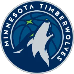
The logo has many nods to Minnesota, the team and, of course, the Timberwolf. There’s the North Star which represents one of the pillars Minnesota hangs its hat on. The star represents Minnesota pride. The new logo represents looking forward and carving out new territory. The open mouth with the teeth showing represents the fierce .energy of not just one Wolf, but a collective unit. To show aggression and fearlessness to the future. The green of the eyes is a nod to the green that surrounds the state whether that be through Northern Lights, reflection of ice crystals in the winter or the flourishing of buds of trees in the spring. The primarily colors include midnight blue, aurora green, lake blue, moonlight grey and frost white. “From the motion and vibrant hues of the Northern Lights, to the depths and reflections of a midnight forest, to the rich contrasts of this great frozen city of the north, the palette is the perfect representation of modern sport colors inspired by the story of Minnesota’s landscape,” Richardson said. “It’s color with a sense of place.” For Richardson, he loves how the logo is simple, yet intense. The logo was designed by Rodney Richardson of RARE Design.
Minnesota Timberwolves
2017 - Present
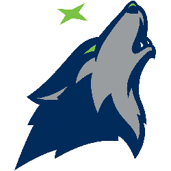
The Timberwolves wolf facing right in blue and grey with a green eye. A green star above the wolf.
Minnesota Timberwolves
2017 - Present
A blue and light blue basketball with a grey border. A green star in the upper left corner.

Minnesota Timberwolves
2017 - Present
The new alternate logo represents looking forward and carving out new territory. The open mouth with the teeth showing represents the fierce .energy of not just one Wolf, but a collective unit. To show aggression and fearlessness to the future. The green of the eyes is a nod to the green that surrounds the state whether that be through Northern Lights, reflection of ice crystals in the winter or the flourishing of buds of trees in the spring.
This is the primary logo without the wordmark.

Minnesota Timberwolves
2009 - 2017
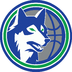
A gray, black and white wolf howling with a blue basketball and timber profile in the background.

Minnesota Timberwolves
2009 - 2017
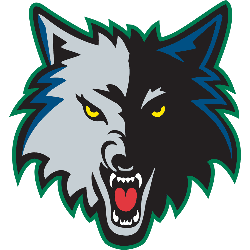
A wolf's head in black, gray, white and blue with a red tongue.

Minnesota Timberwolves
1997 - 2008
Interlocking black, white and blue letters "MT" in a gray wolf's head. The "MT" stand for the city and the team nickname Minnesota Timberwolves.

Minnesota Timberwolves
1997 - 2008
A wolf's head in black, gray, white and blue with a red tongue and yellow eyes with a green outline.
Minnesota Timberwolves
1990 - 1996
Blue and white wolf's head with green eyes on silver basketball with green and blue outline.
Unlocking Secrets: Minnesota Timberwolves Logo History Revealed!
Welcome to our channel, where we delve into the intriguing history of the Minnesota Timberwolves logo! In this video, we unravel the evolution of the Minnesota Timberwolves logo from its inception to the present day. Join us on a journey through time as we decode the symbolism and design choices behind each iteration. Explore the fascinating transformation of one of the NBA's iconic logos with us! Don't forget to like, share, and subscribe for more captivating content!
The Story of Minnesota Timberwolves Alternate Logos
Basketball Sports Fan Products
Auto Amazon Links: No products found.


