Our Milwaukee Hawks logo wordmark collection highlights the team’s early wordmark designs. From its brief tenure to the Milwaukee Bucks logo history, explore the evolution, find Milwaukee logo png files, and see Milwaukee Bucks logo basketball ties, preserving unique wordmarks for fans of Milwaukee’s basketball heritage.
Milwaukee Hawks
1954 - 1955
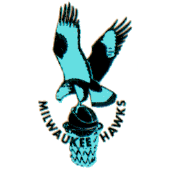
For what would ultimately prove to be their last season in Milwaukee, the Hawks updated their color scheme to blue. A change to their logo accompanied the shift with the hawk now in a light blue and black, still clutching a basketball over an unguarded hoop with the wordmark "MILWAUKEE HAWKS" arched upwards below.
Milwaukee Hawks
1952 - 1955
A single-lined wordmark "MILWAUKEE" in blue in a small font and "HAWKS" in blue grey in a large font.
Font: Custom
Milwaukee basketball wordmark logos
The Milwaukee Hawks logo history began in 1951 when the team moved from Tri-Cities, using a simple wordmark with “Hawks” in bold lettering. After relocating to St. Louis in 1955, the franchise evolved into the Atlanta Hawks. Meanwhile, the Milwaukee Bucks logo history started in 1968 with a cartoon buck spinning a basketball, reflecting a friendly design. First, the Bucks introduced a green-sweatered buck on a wordmark. Then, a 1993 aggressive buck head emerged because fans sought a fiercer look. Now, these wordmark logos shape Milwaukee’s basketball identity. Visit the NBA Bucks page for team details.
Our Milwaukee Hawks logo wordmark collection preserves the 1951 design, while the Milwaukee Bucks logo basketball evolution showcases the 2015 refined buck head, a favorite for fans seeking Milwaukee logo png files. Because they’re historic, collectors value these wordmark logos tracing Milwaukee’s basketball legacy. For the primary design, check our Milwaukee Hawks primary logo. Thus, this wordmark logo collection reflects Milwaukee’s rich sports history.

