Take flight with the Milwaukee Hawks logo and its storied past. From its short-lived Milwaukee days to the Bucks’ legacy, we explore the Milwaukee Bucks logo history, share Milwaukee logo png files, and highlight the Milwaukee Bucks logo basketball, celebrating the team’s bold spirit for every fan.
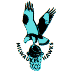
Milwaukee Hawks
1954 - 1955
For what would ultimately prove to be their last season in Milwaukee, the Hawks updated their color scheme to blue. A change to their logo accompanied the shift with the hawk now in a light blue and black, still clutching a basketball over an unguarded hoop with the wordmark "MILWAUKEE HAWKS" arched upwards below.
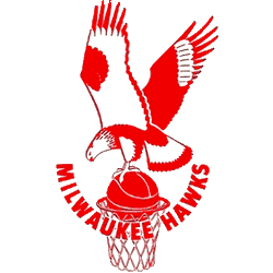
Milwaukee Hawks
1952 - 1954
The Hawks adopted a red and white color scheme in the Cream City, a high flying Hawk in red gripping a red basketball on top of a basketball hoop with a wordmark "MILWAUKEE HAWKS" in red in a U shape.
The Wingspan of the Milwaukee Hawks Logo
The Milwaukee Bucks logo history traces back to the Milwaukee Hawks logo from 1951 to 1955. First, a simple hawk silhouette graced uniforms. Then, red and white colors shone since fans loved vibrancy. Now, the Bucks carry the legacy. Visit the NBA Hawks page for team details. The Hawks symbol soars with pride.
The Milwaukee Bucks logo basketball era began in 1968, replacing the Hawks’ hawk with a cartoonish buck. Because it’s crisp, fans seek Milwaukee logo png files for wallpapers. For unique designs, check our Milwaukee Hawks Wordmark logo. It captures Milwaukee’s early basketball spirit.


