Cleveland Cavaliers
2023 - Present
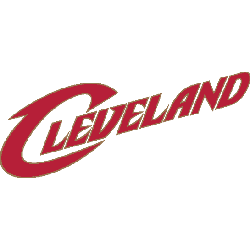
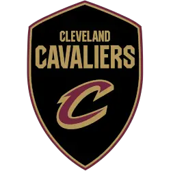
Continue with the black with gold and maroon shield and wordmark “CLEVELAND CAVALIERS” in gold with a custom letter “C” in maroon with gold highlights. A new shade of gold, replacing mustard as their primary yellow across the board.
Cavaliers Wordmark Logo
The Cleveland Cavaliers have a long and storied history that is proudly represented by their iconic wordmark logo, particularly in relation to the Cleveland Cavaliers Primary logo. The original logo was created in 1970 when the team joined the NBA as an expansion franchise, featuring a stylized “C” with serifs on either side of its vertical line. This design was used until 1983, when it was replaced by another version of the same basic concept but with more modern typography and smoother lines.
In 1994, following two decades of success in which they had become one of basketball's most recognizable franchises, the Cavs unveiled an updated look for their wordmark logo that remains largely unchanged to this day: a bolder font style featuring rounded edges and curves at both ends instead of serifs; larger lettering for greater impact; plus orange accents to add vibrancy and energy to represent Cleveland's vibrant cityscape. This current iteration has been seen on all official merchandise since then - from jerseys worn during games to t-shirts sold online - making it one of the sports' most enduring logos ever created!
Overall, whether viewed through nostalgia or modern eyesight alike – there can be no denying how powerful this symbol is within sports culture today! It stands out among other teams' logos due not only to its unique shape but also because it embodies so much about what makes up being part of 'Cleveland'. From championship runs over multiple eras down through heartbreak losses (and everything else in between), these three letters continue to serve as timeless reminders of why we still love our beloved Cavaliers after so many years have gone past...
Cleveland Cavaliers
2017 - Present
A double lined wordmark with "CLEVELAND" on top and "CAVALIERS" on the bottom in a wine color.
Font: Modified version of Pirate Ship by Jayde Garrow
https://www.dafont.com/pirate-ship.font?text=CAVALIERS&psize=l
Cleveland Cavaliers
2017 - 2022
A single lined wordmark "CAVS" in wine with a gold outline.
Font: Modified version of Pirate Ship by Jayde Garrow
https://www.dafont.com/pirate-ship.font?text=CAVALIERS&psize=l