Cleveland Cavaliers
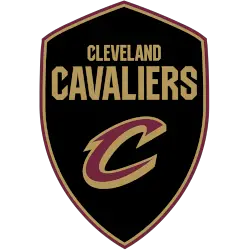
Continue with the black with gold and maroon shield and wordmark “CLEVELAND CAVALIERS” in gold with a custom letter “C” in maroon with gold highlights. A new shade of gold, replacing mustard as their primary yellow across the board.

Cleveland Cavaliers
2017 - 2023
The new Cavaliers logos will carry forward both the popular “C-Sword” and “C” logos from previous years, as well as the original expression of Cavaliers Wine & Gold, the team’s first colors in their inaugural 1970 season, which were re-introduced in 2010-11. Navy remains a complimentary color, while black is officially introduced as a new and permanent addition to the Cavaliers' color palette.
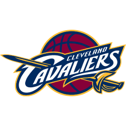
Cleveland Cavaliers
2011 - 2017
The Cavaliers switched to a modified version of the team's classic wine and gold scheme from the 2003 - 2004 season and a metallic gold and crimson shade of wine, with navy blue added to the color scheme of the piercing sword with a basketball in the background.
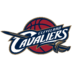
Cleveland Cavaliers
2004 - 2011
The Cavaliers logo in 2004, is a gold sword piercing through the wordmark "CLEVELAND CAVALIERS" in white and navy blue trim, with a wine basketball surrounding it. The "C" from the "Cavaliers" is hooked around the sword.

Cleveland Cavaliers
1995 - 2004
The logo used in this period was of a orange and black outlined basketball on its way down a white net, surrounded by a black square and a wordmark "CAVS" in blue with black line below the basket.
Cleveland Cavaliers
1984 - 1995
In the 1983 - 1984 season, a new logo scheme featured a orange wordmark "CAVS" as the logo. The “V” was designed like a hoop with a basketball entering it.
Cleveland Cavaliers
1971 - 1984
The original Cleveland logo was that of a orange swashbuckling cavalier looking right with a sword pointing forward, a wordmark on top "CAVALIERS" in orange with yellow trim and "CLEVELAND" on the bottom with a yellow basketball in the background.
Did The Cleveland Cavaliers Ever Have The BEST Logo in Basketball?
Let's explore the history of the Cleveland Cavaliers logo, exploring the evolution of their branding from the 1970s to the present day. Join the Sports History Group as we highlight key changes in the Cavs logo, showcasing the rich history...
Cleveland Cavaliers Logo Through the Years
The Cleveland Cavaliers logo history highlights how the team's branding has evolved with time. While earlier versions included more detailed imagery, recent logos adopt a cleaner design. You can explore how these updates compare with other NBA team logos to get a broader sense of the league’s visual trends.
The Cavaliers' official site also features the current Cleveland Cavaliers official logo, reflecting the team’s modern image. Fans and designers can download the Cleveland Cavaliers logo PNG to use for wallpapers, posters, or digital artwork.
Basketball Sports Fan Products
